Select this license type when you are developing an app for iOS, Android, or Windows Phone, and you will be embedding the font file in your mobile application's code.
Astrid Grotesk™
by Eclectotype
Individual Styles from $40.00
Complete family of 40 fonts: $350.00

Astrid Grotesk Font Family was
designed by
Dave Rowland and
published by
Eclectotype. Astrid Grotesk contains
40
styles and family package options.
More about this family
- Aa Glyphs
-
Best ValueFamily Packages
- Individual Styles
- Tech Specs
- Licensing
Astrid Grotesk Normal Width Family
16 fontsPer style:
$15.62
Pack of 16 styles:
$250.00
Per style:
$18.75
Pack of 8 styles:
$150.00
Per style:
$18.75
Pack of 8 styles:
$150.00
Per style:
$18.75
Pack of 8 styles:
$150.00
About Astrid Grotesk Font Family
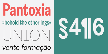
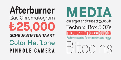
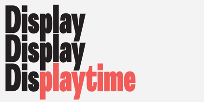
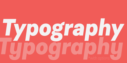
Astrid Grotesk is a normalized version of Schizotype Grotesk. Normalized; not neutralized. Where many neo-grotesks appear cold with their harsh neutrality, Astrid has a warmth, eminating from its (for want of a better word) clunkiness. With the latest update, it becomes a true workhorse, with a range of widths and italics for the normal widths. Astrid Grotesk, while being clearly a neo-grotesk in appearance, has a personality all of its own. Standout characters include the f and t, and the default binocular g, unusual in neo-grotesks. And the right angled terminals on c, e and s. Stylistic sets offer up alternate forms of a, g, y, I, @, dutch IJ, german eszett and l. A full complement of numerals is included: proportional and tabular, lining and oldstyle, plus fractions, subscript and superscript. Note also that the tabular figures are duplexed across weights - very useful when highlighting specific entries in tables. The tabular figures feature also substitutes in fixed width (across all weights) comma and period, so your decimals line up perfectly always. Lastly, case sensitive forms of certain glyphs are included for all-cap settings. This typeface will be useful for corporate identities and branding work. It’s spaced more for text settings in the normal width, and gets more display-optimized as the width decreases, but with careful tracking, all styles can sing at display sizes. Bored of those other Swiss style typefaces? Astrid Grotesk could be the face you need to breathe new life into your designs. Coupled with Schizotype Grotesk, its more eccentric cousin, you've got an unorthodox branding system ready to use straight out of the box.
Designers: Dave Rowland
Publisher: Eclectotype
Foundry: Eclectotype
Design Owner: Eclectotype
MyFonts debut: May 7, 2018
Astrid Grotesk™
is a trademark of Eclectotype.
About Eclectotype
Eclectotype is the foundry of Dave Rowland, and has been making retail and custom type for over a decade (formerly known as Schizotype). As the name suggests, the catalogue features an eclectic mix of styles from text workhorses to full on display faces. This is not a foundry that likes to stick to trends or expectations, often to the detriment of commercial success, but strives to make every release useful, original, and interesting.
Read more
Read less
- Choosing a selection results in a full page refresh.