Select this license type when you are developing an app for iOS, Android, or Windows Phone, and you will be embedding the font file in your mobile application's code.
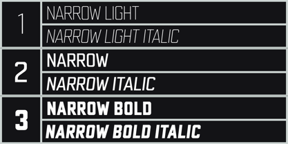
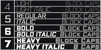
Block Capitals
by K-Type
Individual Styles from $20.00 USD
Complete family of 20 fonts: $200.00 USD


Block Capitals Font Family was
designed by
Keith Bates and
published by
K-Type. Block Capitals contains
20
styles and family package options.
More about this family
- Aa Glyphs
-
Best ValueFamily Packages
- Individual Styles
- Tech Specs
- Licensing
About Block Capitals Font Family
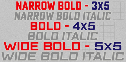
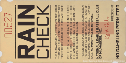
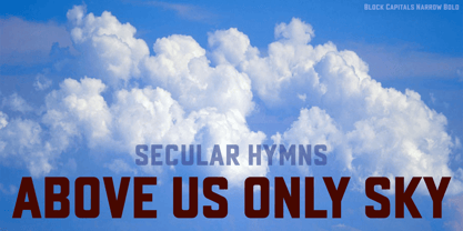
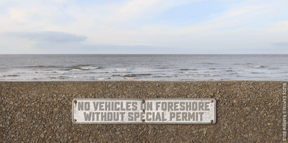
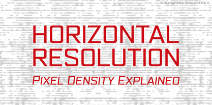
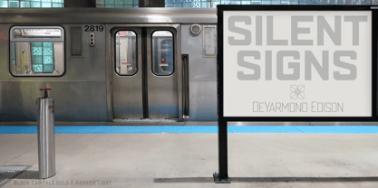
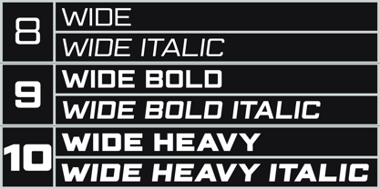
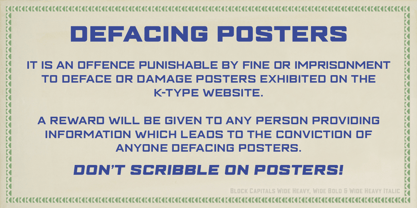
BLOCK CAPITALS is a square, geometric, small caps display face that avoids fashionable foibles and exudes the neutral, unpretentious functionality of time-honoured block lettering.
The family has three widths (Narrow, Normal and Wide), and the Bold weights are loosely based on well-used squared nets – 3x5, 4x5 and 5x5. However, the typeface escapes its grid origins whenever necessary with slightly modulated stroke weights, sensitive spacing and careful kerning. The aim is to retain the strength and simplicity of strictly geometric characters while introducing barely perceptible refinements that add elegance and usability.
That said, letters and numbers line up horizontally without overlapping the capline or baseline, even the tail of the Q does not descend below the Baseline. Diacritics are modesty proportioned, accented characters extending no farther than necessary, allowing the leading on multiple lines of text to be kept to a minimum.
Designers: Keith Bates
Publisher: K-Type
Foundry: K-Type
Design Owner: K-Type
MyFonts debut: Jan 5, 2024
Block Capitals

About K-Type
K-Type is a small, independent type foundry based in Manchester England, offering a unique range of high quality fonts which are modestly and simply priced for designers, small businesses and large organisations.In addition to creating new typefaces resulting from formal experimentation, many K-Type fonts show the influence of inspirational artists and designers, many exploring the mix of insular and eclectic that has forged the typographical landscape of Britain and America.K-Type is also keen to make affordable fonts from styles which possess cultural currency or an existing social presence, generally redrawn to include comprehensive character sets containing a full complement of Latin Extended-A glyphs. New, previously unavailable weights and italics are often designed and added.
Read more
Read less
- Choosing a selection results in a full page refresh.