Select this license type when you are developing an app for iOS, Android, or Windows Phone, and you will be embedding the font file in your mobile application's code.
Built™
by Typodermic



- Aa Glyphs
-
Best ValueFamily Packages
- Individual Styles
- Tech Specs
- Licensing
Per Style:
$16.99 USD
Pack of 10 styles:
$169.95 USD
About Built Font Family
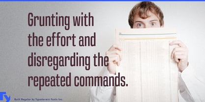
In the fast-paced world of journalism, where every word carries weight and every headline must captivate, Built emerges as the typeface that understands the pulse of modern media. This meticulously crafted font family marries the gravitas of traditional newsprint with the demands of digital-age publishing, offering a versatile toolkit for designers and editors alike.
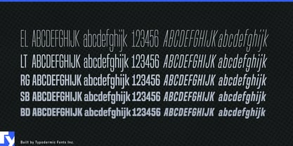
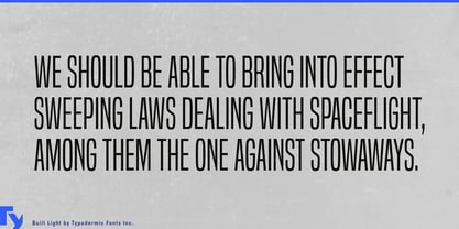
Built's DNA is rooted in the golden age of print journalism, with subtle curls and wraparound curves that whisper of broadsheets and bold proclamations. Yet it stands firmly in the present, offering five weights from Extra-Light to Bold that adapt seamlessly to both print and screen. This typeface doesn't just catch the eye—it holds it, conveying authority and credibility with every character. What truly sets Built apart is its ingenious approach to scalability. As the weight lightens, the typeface narrows, allowing for expansive headlines that maintain their impact and legibility across all mediums. This innovative design solves the perennial challenge of copyfitting, empowering designers to create oversized page titles that command attention without sacrificing readability or space.
Built's commitment to precision extends to its handling of numerals and symbols. By disabling kerning for these characters, the typeface ensures perfect alignment of numbers, monetary symbols, and mathematical operators—a godsend for financial reporting and data-driven journalism. This attention to detail extends to fractions, primes, and ordinals, all designed to maintain clarity and professionalism in even the most complex headlines. The typeface's versatility shines through its support for a vast array of Latin-based European writing systems. From the fjords of Norway to the steppes of Central Asia, Built speaks the language of journalism fluently. It even extends its reach to Vietnamese, ensuring that your headlines resonate across diverse linguistic landscapes.
In an era where trust in media is paramount, Built provides the visual foundation for credible, impactful journalism. Its clean lines and balanced forms lend themselves to headlines that inform rather than sensationalize, making it an ideal choice for publications that value substance as much as style.
Whether you're crafting front-page news for a major daily, designing eye-catching web headlines, or developing a cohesive brand identity for a digital media outlet, Built offers the perfect blend of form and function. It's more than a typeface—it's a statement of journalistic intent, ready to deliver your message with clarity and conviction to readers around the globe.
Designers: Ray Larabie
Publisher: Typodermic
Foundry: Typodermic
Design Owner: Typodermic
MyFonts debut: Jul 5, 2013

About Typodermic
Welcome to Typodermic Fonts, a spirited type foundry rooted in Nagoya, Japan, started by the Canadian typeface designer, Raymond Larabie in 2001. Our library brims with 500+ diverse typefaces to fuel creativity in graphic design, advertising, web, and app development. As digital type pioneers, we adopted web fonts and app licensing early, consistently pushing the design envelope. With Canadian heart and Japanese precision, we're your global partners in extraordinary typography. Explore Typodermic Fonts—where creativity meets character.
Read more
Read less
- Choosing a selection results in a full page refresh.