Select this license type when you are developing an app for iOS, Android, or Windows Phone, and you will be embedding the font file in your mobile application's code.
Comic Sans®
by Microsoft Corporation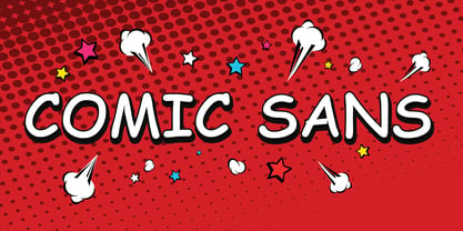

- Aa Glyphs
-
Best ValueFamily Packages
- Individual Styles
- Tech Specs
- Licensing
Per Style:
$32.25 USD
Pack of 4 styles:
$129.00 USD
Comic Sans Complete Family Pack
4 fontsPer Style:
$32.25 USD
Pack of 4 styles:
$129.00 USD
About Comic Sans Font Family
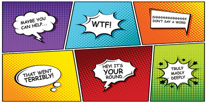
Featuring elements such as speech bubbles and cartoon dingbats, Comic Sans Pro extends the versatility of the original Comic Sans, designed by Vincent Connare for Microsoft in 1994. Hats off to Monotype Imaging for enlivening Comic Sans and getting it back to its roots as a comic book lettering face. Now everyone can write with more panache - and look even more like a pro using swashes, small caps and other typographic embellishments," said Connare.
"Every day, millions of people rely on Comic Sans for countless applications ranging from scrapbooking to school projects," said Allan Haley, director of words and letters at Monotype Imaging. "Comic Sans is also a favorite in professional environments, used in medical information, instructions, ambulance signage, college exams, corporate mission statements and executive reprimands - even public letters from sports team owners to their fans. Breaking up with your spouse? Why not write a letter in Comic Sans Pro, embellished with a typographic whack!, pow! or bam! Comic Sans is everywhere, and now it's even better."
The Comic Sans Pro family includes regular and bold fonts, in addition to two new italic and bold italic fonts drawn by Monotype Imaging's Terrance Weinzierl. "Our aim is to put the 'fun' back in 'functional.' We can't wait to see Comic Sans Pro used in everything from second wedding announcements to warning labels," said Weinzierl. "Long live Comic Sans!"
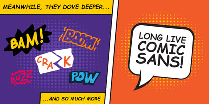
Comic Sans Pro contains a versatile range of typographic features including swashes, small caps, ornaments, old style figures and stylistic alternates - all supported by the OpenType® font format. OpenType-savvy applications, such as Adobe® Creative Suite®, QuarkXPress® or Mellel™ software are required to access these features. Comic Sans Pro can also be used in new versions of Microsoft® Office including Microsoft Word 2010 and Microsoft Publisher 2010. In addition, Comic Sans Pro includes a set of ornaments and symbols, including speech bubbles, onomatopoeia and dingbats, pre-sized to work well as bullets."
Designers: Vincent Connare
Publisher: Microsoft Corporation
Foundry: Microsoft Corporation
Design Owner: Ascender
MyFonts debut: Mar 16, 2006
About Microsoft Corporation
The Typography Group at Microsoft is responsible for both fonts and the font rendering systems in Windows. Since version 3.1 the primary font system built into Windows has been the TrueType system, licensed from Apple in a deal (with hindsight) remarkably beneficial to Microsoft. Working with Monotype, the Microsoft Typography Group produced fine TrueType versions of Arial, Times New Roman and Courier New, tuned to be extremely legible on the screen; these were all ready for the launch of Windows 3.1. Since then these core fonts have been developed to cover more and more of the world’s languages. In the mid-1990s under Robert Norton a program of truly new type designs was begun, using TrueType technology to render faithfully the bitmaps and outlines designed by Matthew Carter (Verdana, Georgia, Tahoma) and by in-house designer Vincent Connare (Trebuchet, Comic Sans). Until August 2002 these “core fonts” were offered freely over the Web, where they made an undoubtedly positive contribution in terms of legibility and font choice. In 1996 the OpenType initiative with Adobe was announced; this is touted as the end of the font wars’, whereby advanced multilingual text layout becomes available, native rendering of PostScript fonts becomes part of Windows 2000, and unwieldy font formats are rationalized. In 1998 the group announced ClearType. This is a very ingenious method to increase legibility on color LCD screens, individually targeting the 3 subpixels (red, green and blue) that make up each pixel. Such a leap forward in readability on these screens is a crucial element to the success of nascent eBook technology. Simon Daniels at the Group’s website keeps font fans and font developers up to date with most aspects of the digital typography scene, and communicates the technicalities of how fonts work in Windows. Updating us about the current (October 2000) activity of the Group, Simon notes: 1999 saw several members of the group leave to join Microsoft’s eBooks group. These included technical lead Greg Hitchcock, developers Beat Stamm and Paul Linerud as well as former Monotype hinters Michael Duggan and Geraldine Wade. The past twelve months has beeen a rebuilding period for the group, with numerous new hires [sic.] replacing earlier departures. The Group continues to provide font related services for Microsoft, and freely licensed tools and technology to the wider type development community. On August 12, 2002 Microsoft discontinued the free availability of the “core fonts”, noting that “the downloads were being abused” in terms of their end-user license agreements. Most commentators took this to mean the company objected to the fact that the fonts were being installed with Linux distributions.
Read more
Read less
- Choosing a selection results in a full page refresh.