Select this license type when you are developing an app for iOS, Android, or Windows Phone, and you will be embedding the font file in your mobile application's code.
Kleptocracy
by Typodermic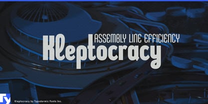

- Aa Glyphs
-
Best ValueFamily Packages
- Individual Styles
- Tech Specs
- Licensing
About Kleptocracy Font Family
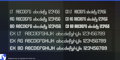
Kleptocracy: the typeface that filches function and flair in equal measure. This compact industrial marvel doesn’t just walk the line between utility and elegance—it dances on it with unexpected grace.
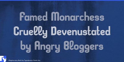
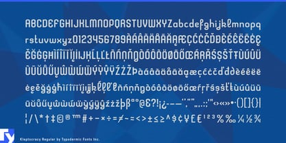
Forged in the crucible of efficiency, Kleptocracy’s assembly-line design purrs with precision where lesser fonts clank and clatter. Its hard edges and utilitarian lines speak of factory floors and blueprints, but look closer—there’s a subtle rebellion in its DNA. Cursive elements weave through the industrial framework like wildflowers sprouting through concrete, adding a touch of whimsy to its workhorse ethic. Observe the gentle curve of the “g,” a small act of defiance against rigid geometry. Notice how the “y” loops with playful abandon, as if sneaking a moment of joy on the production line. These details transform Kleptocracy from a mere typeface into a storyteller, each character a miniature drama of form versus function.
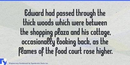
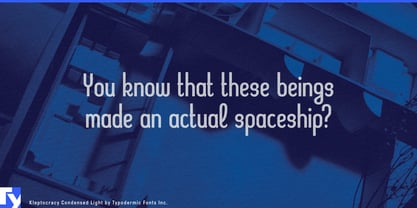
With three weights, three widths, and a full set of italics, Kleptocracy is a master of disguise. It can slip into the tightest layouts or sprawl across billboards with equal aplomb. Its compact design makes it the perfect accomplice for small spaces, while its industrial roots give it the confidence to command attention in any setting. Kleptocracy’s linguistic reach is as ambitious as its design. It pilfers characters from across Europe, supporting a vast array of Latin-based writing systems. From the fjords of Norway to the plains of Hungary, Kleptocracy speaks the language of your audience with industrial precision and a hint of mischief.
Ready to embezzle some attention for your next project? Let Kleptocracy be your partner in design crime. It’s more than a font—it’s a heist of harmony, stealing hearts with its perfect balance of strength and subtlety.
Designers: Ray Larabie
Publisher: Typodermic
Foundry: Typodermic
Original Foundry: Typodermic
Design Owner: Typodermic
MyFonts debut: Jul 29, 2005

About Typodermic
Welcome to Typodermic Fonts, a spirited type foundry rooted in Nagoya, Japan, started by the Canadian typeface designer, Raymond Larabie in 2001. Our library brims with 500+ diverse typefaces to fuel creativity in graphic design, advertising, web, and app development. As digital type pioneers, we adopted web fonts and app licensing early, consistently pushing the design envelope. With Canadian heart and Japanese precision, we're your global partners in extraordinary typography. Explore Typodermic Fonts—where creativity meets character.
Read more
Read less
- Choosing a selection results in a full page refresh.