Select this license type when you are developing an app for iOS, Android, or Windows Phone, and you will be embedding the font file in your mobile application's code.
Meposa
by Typodermic

- Aa Glyphs
-
Best ValueFamily Packages
- Individual Styles
- Tech Specs
- Licensing
Per Style:
$42.47 USD
Pack of 2 styles:
$84.95 USD
About Meposa Font Family
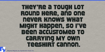
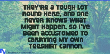
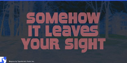
Prepare to have your expectations shattered by Meposa, a typeface that defies classification and laughs in the face of convention. This isn’t just a font; it’s a typographic mutiny, blending elements from across centuries and cultures into a design that refuses to be pinned down by era or genre.
Imagine wood type storming out of a 19th-century print shop, hijacking a 1970s custom van, and careening through a digital wormhole—that’s Meposa. Its mixed-case letters with brazenly open apertures thumb their nose at typographic tradition, creating a visual language that’s simultaneously familiar and alien. This is not your grandfather’s wood type, nor is it your father’s retro script. Meposa is the lovechild of historical craft and future shock, raised by wolves in a design dimension all its own. Drawing inspiration from the rebellious spirit of 1970s van culture, Meposa channels the raw creativity of artists who turned vehicles into canvases. But it doesn’t stop there. This typeface time-travels at will, borrowing the authenticity of historical wood type, the edginess of retro-tech aesthetics, and the sleekness of modern design. The result? A typographic Frankenstein’s monster that’s unexpectedly beautiful in its audacity.
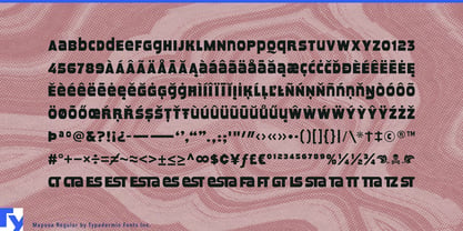
Meposa doesn’t just break the mold—it smashes it to pieces and reassembles them into something entirely new. It’s the perfect choice for designers who want to create work that stops viewers in their tracks, forcing them to question whether they’re looking at something vintage, contemporary, or from an alternate timeline altogether. This linguistic chameleon speaks fluently across a vast array of Latin-based European writing systems. From the fjords of Norway to the plains of Africa, Meposa adapts its unconventional forms to languages as diverse as Luxembourgish and Zapotec, ensuring your message maintains its rebellious spirit, no matter where it roams.
Choose Meposa when you need typography that doesn’t just think outside the box, but questions the very existence of boxes. In a world of typographic conformity, Meposa stands as a testament to the power of breaking every rule in the book… and then writing a new book entirely.
Designers: Ray Larabie
Publisher: Typodermic
Foundry: Typodermic
Design Owner: Typodermic
MyFonts debut: May 17, 2005

About Typodermic
Welcome to Typodermic Fonts, a spirited type foundry rooted in Nagoya, Japan, started by the Canadian typeface designer, Raymond Larabie in 2001. Our library brims with 500+ diverse typefaces to fuel creativity in graphic design, advertising, web, and app development. As digital type pioneers, we adopted web fonts and app licensing early, consistently pushing the design envelope. With Canadian heart and Japanese precision, we're your global partners in extraordinary typography. Explore Typodermic Fonts—where creativity meets character.
Read more
Read less
- Choosing a selection results in a full page refresh.