Select this license type when you are developing an app for iOS, Android, or Windows Phone, and you will be embedding the font file in your mobile application's code.
Nesobrite
by Typodermic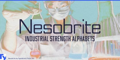

- Aa Glyphs
-
Best ValueFamily Packages
- Individual Styles
- Tech Specs
- Licensing
About Nesobrite Font Family
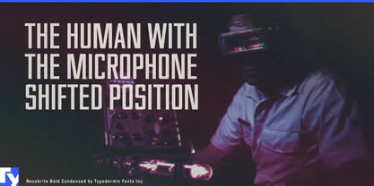
In the high-stakes world of research communication, I’ve discovered a typographic catalyst that will transform your headings and titles into eye-catching marvels. Enter Nesobrite: the display typeface that’s as robust as your most groundbreaking hypotheses.
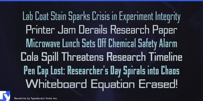
Nesobrite isn’t for your mundane methods sections or literature reviews. No, this font is the heavy hitter of headers, the titan of titles, the superstar of short text runs. Its linear, mechanical structure is engineered to grab attention faster than a superconductor at absolute zero. Picture your next conference poster. That crucial title that encapsulates years of work? Set it in Nesobrite and watch colleagues’ eyes lock onto it from across the hall. This typeface doesn’t whisper—it proclaims your research with the authority of a Nobel laureate giving a keynote address.
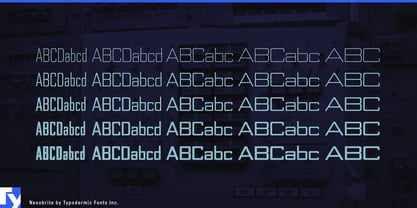
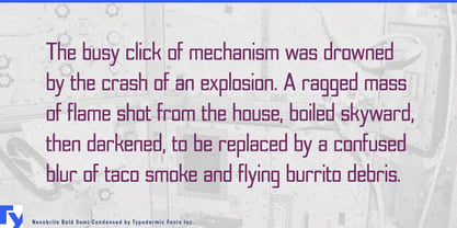
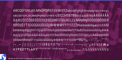
With five different widths and weights, plus italics, Nesobrite offers more variety than a gene sequencing lab. Need a punchy subtitle for your TED talk? The bold condensed version will do the trick. Want to make your chapter titles pop in that textbook you’re writing? Nesobrite’s got you covered. But remember, like a precision instrument, Nesobrite is designed for specific applications. It’s not meant for long paragraphs or body text—that would be like using an electron microscope to check your hair. No, Nesobrite shines brightest in short bursts, much like the flashes of insight that drive scientific discovery. From journal covers to presentation slides, from book jackets to infographic headlines, Nesobrite ensures your most important messages stand out in the crowded landscape of academic publishing. It’s the typographic equivalent of that crucial graph that makes your entire argument click into place.
So, esteemed colleagues, as we push the boundaries of human knowledge, let’s ensure our most critical ideas are presented with equal innovation. Use it wisely, use it boldly, and watch as your titles and headings capture imaginations and ignite curiosity. Choose Nesobrite for your display text, and let your research headlines speak with the impact they deserve. After all, in the fast-paced world of scientific communication, you’ve got mere seconds to make your mark. Make them count with Nesobrite.
Designers: Ray Larabie
Publisher: Typodermic
Foundry: Typodermic
Design Owner: Typodermic
MyFonts debut: Mar 7, 2007
About Typodermic
Welcome to Typodermic Fonts, a spirited type foundry rooted in Nagoya, Japan, started by the Canadian typeface designer, Raymond Larabie in 2001. Our library brims with 500+ diverse typefaces to fuel creativity in graphic design, advertising, web, and app development. As digital type pioneers, we adopted web fonts and app licensing early, consistently pushing the design envelope. With Canadian heart and Japanese precision, we're your global partners in extraordinary typography. Explore Typodermic Fonts—where creativity meets character.
Read more
Read less
- Choosing a selection results in a full page refresh.