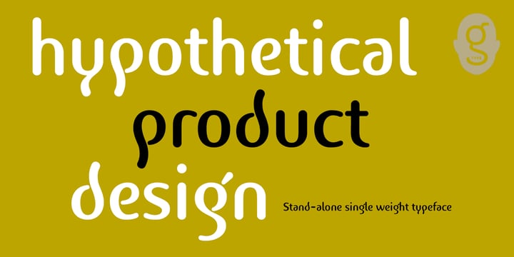
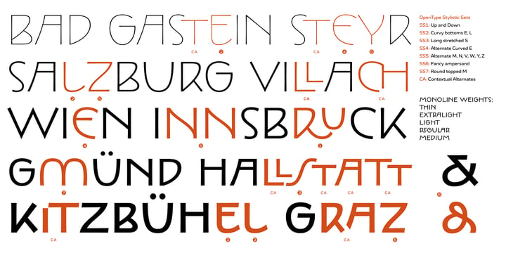
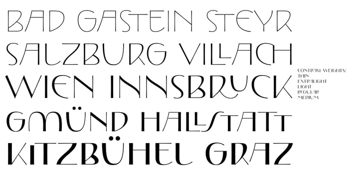
After releasing the Penguin family and Dartangnon with other foundries, Nick Cooke decided he would rather issue all future releases through his own
G-Type foundry, launched in November 1999 in order to develop innovative, original, but most importantly, usable typefaces.
Nick started as a lettering artist in London in 1982 crafting type by hand for book jackets, but doesn’t miss the pre-digital age and puts his success down to “obsession, perseverance, thought and effort”. He controls every aspect of the creative process with particular emphasis placed on consistent character shapes, accurate positioning and extensive kerning.
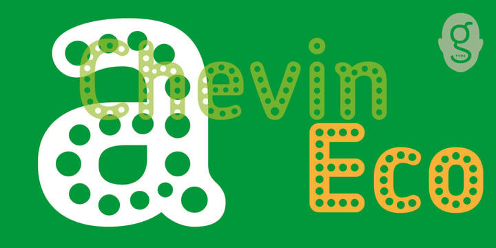
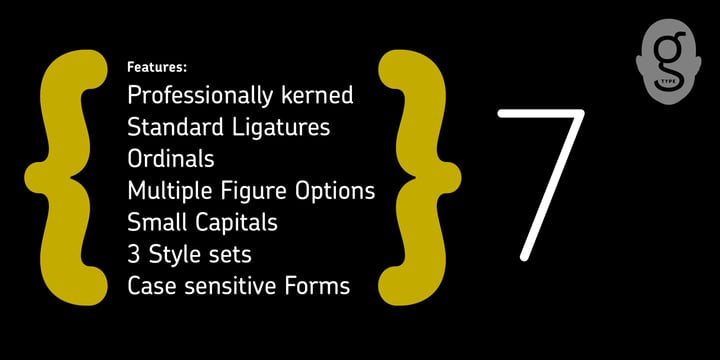
Most of the G-Type collection comprises families in a useful range of weights with true italics; Chevin, Houschka, Nubian and the Sans & Serif Precious families. Houschka has an Alternate version with hanging numerals and non-rounded A, W and w, “for those people irked at the W’s resemblance to part of The Average White Band logo!”
Legibility is of prime importance to Nick and he has designed most of his fonts to work equally well as both text and display types. This duality is qualified by Nick’s advice on spacing: “for smallish text I would suggest an overall track of 2 or 3, and for large display sizes I would use minus tracking dependent on size”.
The multi-purpose suitability of G-Type fonts is borne out by the variety of environments they’re used in, from national newspapers (Mail on Sunday) to supermarket signage (Tesco), album sleeves (Peter Gabriel) to Corporate Identity (Royal Mail), magazines (New Woman, Garden Answers) to branding (Scottish Power, Cadbury-Schweppes, SKF, Birmingham Selfridges).


