Select this license type when you are developing an app for iOS, Android, or Windows Phone, and you will be embedding the font file in your mobile application's code.
Weekly
by Los Andes
Individual Styles from $0.00
50% Off
Complete family of 60 fonts: $289.00


Weekly Font Family was
designed by
Jorge Cisterna and
published by
Los Andes. Weekly contains
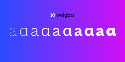
60
styles and family package options.
More about this family
- Aa Glyphs
-
Best ValueFamily Packages
- Individual Styles
- Tech Specs
- Licensing
Weekly Pack
40 fontsPer style:
$5.75
$2.88
Pack of 40 styles:
$230.00
$115.00
Weekly Pro Family
20 fontsPer style:
$10.95
$5.48
Pack of 20 styles:
$219.00
$109.50
Weekly Basic Family
20 fontsPer style:
$9.45
$4.73
Pack of 20 styles:
$189.00
$94.50
About Weekly Font Family
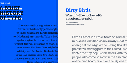
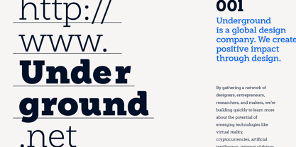
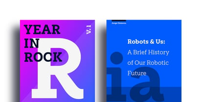
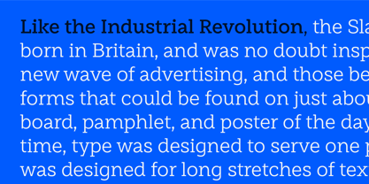
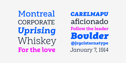
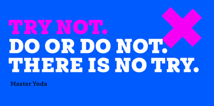
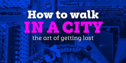
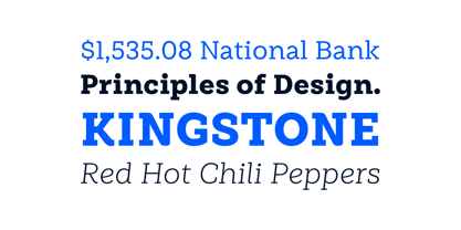
Weekly: a slab serif that wants to be a sans. The font was created under the premise that it can be used as a sans: a fresh design without that retro feel typical of slab fonts. As a result, we developed an Egyptienne font—more simple compared to others of its kind, a feature that gives it its unique personality. Weekly was based on fonts with humanist proportions, such as ‘Oficina’ and ‘Caecilia’, both created in the ’90s. Typefaces like these give designers the possibility to use them in books or magazines, in contrast to geometric slab fonts or early 20th century fat faces, which are mainly used for advertising or display text. Another feature that reminds us of humanist sans fonts is the small difference between x-height and cap-height. Some characters in Weekly like ‘a’ or ‘g’ lack serifs and some like ‘c’ or ’s’ have short serifs, giving it a semi-serif air. Weekly comes in both light and heavy weights. The heavier ones bear resemblance to Egyptienne slab serif typefaces with strong personality. These variants are ideal for use in posters and big, powerful headings.
Designers: Jorge Cisterna
Publisher: Los Andes
Foundry: Los Andes
Design Owner: Los Andes
MyFonts debut: Jun 7, 2017
Weekly
About Los Andes
Located in Concepción, Chile, Los Andes was established in 2011 by Daniel Hernandez, Miguel Hernandez and Luciano Vergara as a spin-off of LatinoType. Their goal was simple: to make typefaces that would simplify the job of the designers who used them. The young foundry published its first typeface, Pantano, that same year and the rest, as they say, is history. With talented designers such as Mendoza Vergara, Daniel Hernández, Luciano Vergara, and Miguel Hernández in its ranks, Los Andes has created a library full of vast variations including everything from bestselling headliner typefaces like Darwin to grunge-inspired rustic families like Pantano. “Our typefaces tell stories,” Luciano says, “we are inspired by travel, nature, experiences and tastes when we design typefaces.” One of their more recent releases, Garden, was inspired by the cheerful and warm people the designers encountered when visiting Brazil in 2013. A young foundry with a wide range of talents and endless inspiration, keep an eye out for more typefaces from Los Andes!
Read more
Read less
- Choosing a selection results in a full page refresh.