Select this license type when you are developing an app for iOS, Android, or Windows Phone, and you will be embedding the font file in your mobile application's code.
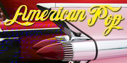
American Pop™
by FontMesa
Licenses from $12.00
Complete family of 3 fonts: $12.00
American Pop Font Family was
designed by
Michael Hagemann and
published by
FontMesa. American Pop contains
3
styles and family package options.
More about this family
- Aa Glyphs
-
Best ValueFamily Packages
- Individual Styles
- Tech Specs
- Licensing
-
American Pop One
-
American Pop Two
-
American Pop Plain
Per style:
$4.00
Pack of 3 styles:
$12.00
About American Pop Font Family
As it is plain to see American Pop resembles the famous cola logo that we all know and love, please stay tuned for more versions of this font coming in the future.
Designers: Michael Hagemann
Publisher: FontMesa
Foundry: FontMesa
Design Owner: FontMesa
MyFonts debut: Dec 16, 2004
American Pop™
is a trademark of FontMesa.
About FontMesa
Founded in 2000 by photographer and type designer Michael Hagemann, FontMesa has specialized in creating type styles of the old west and fonts for sign lettering. Some fonts are classic Italian (Tuscan) and French revivals with new lowercase letters added while others were created from a small sample of letters found on old documents never intended to be a complete font. FontMesa continues to research and find old, long lost type from the 1800s, then revive them into the digital world where they will never be forgotten. With a FontMesa font you can be assured of a quality product; all fonts are drawn and kerned by hand and never created by automatic scanning methods.
Read more
Read less
- Choosing a selection results in a full page refresh.