Select this license type when you are developing an app for iOS, Android, or Windows Phone, and you will be embedding the font file in your mobile application's code.
Banks and Miles
by K-Type
Individual Styles from $20.00
Complete family of 9 fonts: $40.00

Banks and Miles Font Family was
designed by
Keith Bates and
published by
K-Type. Banks and Miles contains
9
styles and family package options.
More about this family
- Aa Glyphs
-
Best ValueFamily Packages
- Individual Styles
- Tech Specs
- Licensing
Per style:
$4.44
Pack of 9 styles:
$40.00
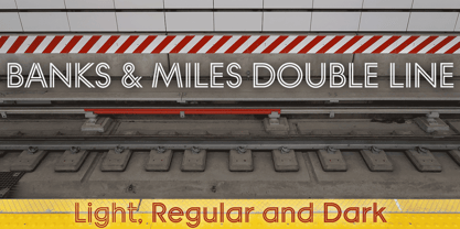
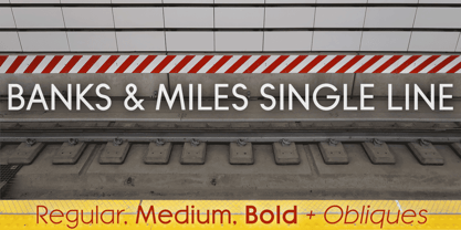
Banks and Miles Single Line Pack
6 fontsBanks and Miles Double Line Pack
3 fontsPer style:
$6.66
Pack of 3 styles:
$20.00
About Banks and Miles Font Family
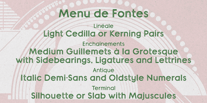
K-Type’s ‘Banks & Miles’ fonts are inspired by the geometric monoline lettering created for the British Post Office in 1970 by London design company Banks & Miles, a project initiated and supervised by partner John Miles, and which included ‘Double Line’ and ‘Single Line’ alphabets. The new digital typeface is a reworking and extension of both alphabets. Banks & Miles Double Line is provided in three weights – Light, Regular and Dark – variations achieved by adjusting the width of the inline. Banks & Miles Single Line develops the less used companion sans into a three weight family – Regular, Medium and Bold – each with an optically corrected oblique. Although the ‘Banks & Miles Double Line’ and ‘Banks & Miles Single Line’ fonts are based on the original Post Office letterforms, glyphs have been drawn from scratch and include numerous adjustments and impertinent alterations, such as narrowing the overly wide Z and shortening the leg of the K. Several disparities exist between the Post Office Double and Single Line styles, and K-Type has attempted to secure greater consistency between the two. For instance, a wide apex on the Double Line’s lowercase w is made pointed to match the uppercase W and the Single Line’s W/w. Also, the gently sloping hook of Single Line’s lowercase j is adopted for both families. The original Single Line’s R and k, which were incongruously simplified, are drawn in their more remarkable Double Line forms, and whilst the new Single Line fonts are modestly condensed where appropriate, rounded letters retain the essentially circular form of the Double Line. Many characters that were not part of the original project, such as @, ß, #, and currency symbols, have been designed afresh, and a full set of Latin Extended-A characters is included. The new fonts are a celebration of distinctive features like the delightful teardrop-shaped bowl of a,b,d,g,p and q, and a general level of elegance not always achieved by inline typefaces. The Post Office Double Line alphabet was used from the early 1970s, in different colours to denote the various parts of the Post Office business which included telecommunications, counter services and the Royal Mail. Even after the Post Office was split into separate businesses in the 1980s, Post Office Counters and Royal Mail continued use of the lettering, and a version can still be seen within the Royal Mail cruciform logo.
Designers: Keith Bates
Publisher: K-Type
Foundry: K-Type
Design Owner: K-Type
MyFonts debut: Jun 16, 2018
Banks and Miles

About K-Type
K-Type is a small, independent type foundry based in Manchester England, offering a unique range of high quality fonts which are modestly and simply priced for designers, small businesses and large organisations.In addition to creating new typefaces resulting from formal experimentation, many K-Type fonts show the influence of inspirational artists and designers, many exploring the mix of insular and eclectic that has forged the typographical landscape of Britain and America.K-Type is also keen to make affordable fonts from styles which possess cultural currency or an existing social presence, generally redrawn to include comprehensive character sets containing a full complement of Latin Extended-A glyphs. New, previously unavailable weights and italics are often designed and added.
Read more
Read less
- Choosing a selection results in a full page refresh.