Select this license type when you are developing an app for iOS, Android, or Windows Phone, and you will be embedding the font file in your mobile application's code.
CA Prologue
by Cape Arcona Type Foundry
Individual Styles from $19.00
Complete family of 6 fonts: $45.00

CA Prologue Font Family was
designed by
Stefan Claudius and
published by
Cape Arcona Type Foundry. CA Prologue contains
6
styles and family package options.
More about this family
- Aa Glyphs
-
Best ValueFamily Packages
- Individual Styles
- Tech Specs
- Licensing
Per style:
$7.50
Pack of 6 styles:
$45.00
About CA Prologue Font Family
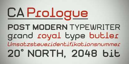
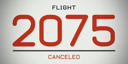
Prologue was designed to look like a postmodern typewriter. With plain and simple upper cases and trickier lower cases. Three weights give a good variety for all kinds of designs and seem especially well made for headlines and short teasers.
Designers: Stefan Claudius
Publisher: Cape Arcona Type Foundry
Foundry: Cape Arcona Type Foundry
Original Foundry: unknown
Design Owner: Cape Arcona Type Foundry
MyFonts debut: Jan 28, 2004
CA Prologue
About Cape Arcona Type Foundry
The Cape Arcona Type Foundry is a type studio based in Essen/Germany run by Stefan Claudius and Thomas Schostok, established in 2002. In our work, we are aiming for typefaces with a non-conformist personality. Over the years, the field of business expanded from individual typeface design to custom font production, corporate and logo design and complex text-font families. This is the kind of work we love: Thinking beyond the ordinary, imagining better worlds and better fonts.
Read more
Read less
- Choosing a selection results in a full page refresh.