Select this license type when you are developing an app for iOS, Android, or Windows Phone, and you will be embedding the font file in your mobile application's code.
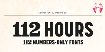
112 Hours
by Device
Individual Styles from $9.00
Complete family of 120 fonts: $390.00

112 Hours Font Family was
designed by
Rian Hughes and
published by
Device. 112 Hours contains
120
styles and family package options.
More about this family
- Aa Glyphs
-
Best ValueFamily Packages
- Individual Styles
- Tech Specs
- Licensing
About 112 Hours Font Family
Rian Hughes’ 15th collection of fonts, “112 Hours”, is entirely dedicated to numbers. Culled from a myriad of sources – clock faces, tickets, watches house numbers – it is an eclectic and wide-ranging set. Each font contains only numerals and related punctuation – no letters. A new book has been designed by Hughes to show the collection, and includes sample settings, complete character sets, source material and an introduction. This is available print-to-order on Blurb in paperback and hardback: http://www.blurb.com/b/5539073-112-hours-hardback http://www.blurb.com/b/5539045-112-hours-paperback From the introduction: The idea for this, the fifteenth Device Fonts collection, began when I came across an online auction site dedicated to antique clocks. I was mesmerized by the inventive and bizarre numerals on their faces. Shorn of the need to extend the internal logic of a typeface through the entire alphabet, the designers of these treasures were free to explore interesting forms and shapes that would otherwise be denied them. Given this horological starting point, I decided to produce 12 fonts, each featuring just the numbers from 1 to 12 and, where appropriate, a small set of supporting characters — in most cases, the international currency symbols, a colon, full stop, hyphen, slash and the number sign. 10, 11 and 12 I opted to place in the capital A, B and C slots. Each font is shown in its entirety here. I soon passed 12, so the next logical finish line was 24. Like a typographic Jack Bauer, I soon passed that too -— the more I researched, the more I came across interesting and unique examples that insisted on digitization, or that inspired me to explore some new design direction. The sources broadened to include tickets, numbering machines, ecclesiastical brass plates and more. Though not derived from clock faces, I opted to keep the 1-12 conceit for consistency, which allowed me to design what are effectively numerical ligatures. I finally concluded one hundred fonts over my original estimate at 112. Even though it’s not strictly divisible by 12, the number has a certain symmetry, I reasoned, and was as good a place as any to round off the project. An overview reveals a broad range that nonetheless fall into several loose categories. There are fairly faithful revivals, only diverging from their source material to even out inconsistencies and regularize weighting or shape to make them more functional in a modern context; designs taken directly from the source material, preserving all the inky grit and character of the original; designs that are loosely based on a couple of numbers from the source material but diverge dramatically for reasons of improved aesthetics or mere whim; and entirely new designs with no historical precedent. As projects like this evolve (and, to be frank, get out of hand), they can take you in directions and to places you didn’t envisage when you first set out. Along the way, I corresponded with experts in railway livery, and now know about the history of cab side and smokebox plates; I travelled to the Musée de l’imprimerie in Nantes, France, to examine their numbering machines; I photographed house numbers in Paris, Florence, Venice, Amsterdam and here in the UK; I delved into my collection of tickets, passes and printed ephemera; I visited the Science Museum in London, the Royal Signals Museum in Dorset, and the Museum of London to source early adding machines, war-time telegraphs and post-war ration books. I photographed watches at Worthing Museum, weighing scales large enough to stand on in a Brick Lane pub, and digital station clocks at Baker Street tube station. I went to the London Under-ground archive at Acton Depot, where you can see all manner of vintage enamel signs and woodblock type; I photographed grocer’s stalls in East End street markets; I dug out old clocks I recalled from childhood at my parents’ place, examined old manual typewriters and cash tills, and crouched down with a torch to look at my electricity meter. I found out that Jane Fonda kicked a policeman, and unusually for someone with a lifelong aversion to sport, picked up some horse-racing jargon. I share some of that research here. In many cases I have not been slavish about staying close to the source material if I didn’t think it warranted it, so a close comparison will reveal differences. These changes could be made for aesthetic reasons, functional reasons (the originals didn’t need to be set in any combination, for example), or just reasons of personal taste. Where reference for the additional characters were not available — which was always the case with fonts derived from clock faces — I have endeavored to design them in a sympathetic style. I may even extend some of these to the full alphabet in the future. If I do, these number-only fonts could be considered as experimental design exercises: forays into form to probe interesting new graphic possibilities.
Designers: Rian Hughes
Publisher: Device
Foundry: Device
Design Owner: Device
MyFonts debut: Apr 23, 2015
112 Hours
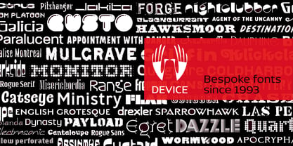
About Device
Device Fonts is the font arm of Rian Hughes’ Device studio, operating out of Kew Gardens, London. An early contributor to FontShop’s FontFont range, Device Fonts was launched in 1997 to carry Hughes’ growing library. It has released over 200 original typefaces covering more than 1000 individual weights, including custom designs for clients as diverse as Mac User, 2000AD and The Teenage Mutant Ninja Turtles. Rian studied at the London College of Communication in London before working for an advertising agency, Smash Hits, i-D magazine and a series of record sleeve design companies. Under the studio banner Device, he provides design, custom type and illustration for advertising campaigns, record sleeves, book jackets, graphic novels and television. He has designed posters for Tokyo fashion company Jun Co.’s Yellow Boots chain, the animated on-board safety film for Virgin Airlines, Eurostar’s poster campaign, a collection of Hawaiian shirts, a range of watches for Swatch, the brochure for MTV Europe’s Music Awards, and numerous book jacket illustrations and CD covers. He has designed many logos for DC, Marvel, Valiant, Image and other comic book companies for such titles as Batman, the X-Men, James Bond, The Avengers and Spider-Man. Long connected with the world of comics, Rian Hughes' first graphic novel was ‘The Science Service’ for Belgian publisher Magic Strip. This was followed by ‘Dare’ for IPC’s short-lived ‘Revolver’, an “iconoclastic revamp of the ’50s comic hero Dan Dare”, written by Grant Morrison. His strips from the Galaxy’s Greatest have been collected in ‘Yesterday’s Tomorrows’ (‘Dare’, ‘Really and Truly’ plus others) and ‘Tales from Beyond Science’ (written by Mark Millar, John Smith and Alan McKenzie). More recently he wrote and drew a ‘Batman: Black and White’ tale, contributed to ‘Vertigo: Magenta’, designed the map of the DC Multiverse and was reunited with Morrison for two stories for ‘Heavy Metal’ magazine. He has contributed to numerous international exhibitions, lectured widely both in the UK and internationally, and a one-man show of his work was held in 2003 the Conningsby Gallery, London. A retrospective monograph, “Art, Commercial” was published in 2002, and "Ten Year Itch", a celebration of the first ten years of Device Fonts, was published in 2005. Recent books include "Custom Lettering of the 20s and 30s", and the all-ages wordless graphic novel "I Am A Number", "Soho Dives, Soho Divas" collects his burlesque drawings, and he sets out his memetics manifesto in Cult-Ure: Ideas Can Be Dangerous. A collection of his logo designs, “Logo a Gogo”, was released in 2018 by Korero Press He has a collection of Thunderbirds memorabilia, a fridge full of vodka, and a stack of easy listening albums which he plays very quietly. www.rianhughes.com www.devicefonts.co.ukThe Premium foundry page can be viewed Here.
Read more
Read less
- Choosing a selection results in a full page refresh.