Select this license type when you are developing an app for iOS, Android, or Windows Phone, and you will be embedding the font file in your mobile application's code.
Dazzle
by Device
Individual Styles from $29.00
Complete family of 3 fonts: $69.00

Dazzle Font Family was
designed by
Rian Hughes and
published by
Device. Dazzle contains
3
styles and family package options.
More about this family
- Aa Glyphs
-
Best ValueFamily Packages
- Individual Styles
- Tech Specs
- Licensing
Per style:
$23.00
Pack of 3 styles:
$69.00
About Dazzle Font Family
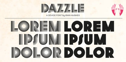
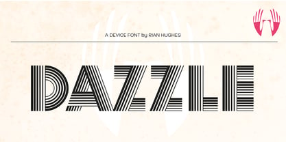
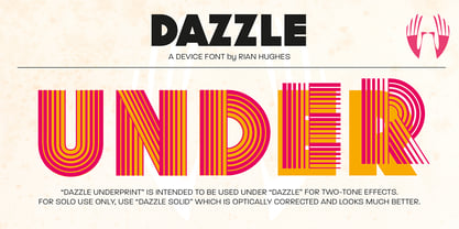
Op-art never looked so good. Taking a cue from the popularity in the 1970s of deco Prismas and their related contemporary interpretations, this geometric font updates the trend. Overlap text in different colours or black and white for eye-teasing moiré combinations. An image above illustrates the use of Dazzle Underprint, a uniform-width version of the font that is placed under Dazzle and used to create two-colour effects simply and easily. Dazzle Underprint is not intended for solo use, only as an underprint — please see
for a range of undecorated weights.
Designers: Rian Hughes
Publisher: Device
Foundry: Device
Design Owner: Device
MyFonts debut: Sep 26, 2006
Dazzle
About Device
Device Fonts is the font arm of Rian Hughes’ Device studio, operating out of Kew Gardens, London. An early contributor to FontShop’s FontFont range, Device Fonts was launched in 1997 to carry Hughes’ growing library. It has released over 200 original typefaces covering more than 1000 individual weights, including custom designs for clients as diverse as Mac User, 2000AD and The Teenage Mutant Ninja Turtles. Rian studied at the London College of Communication in London before working for an advertising agency, Smash Hits, i-D magazine and a series of record sleeve design companies. Under the studio banner Device, he provides design, custom type and illustration for advertising campaigns, record sleeves, book jackets, graphic novels and television. He has designed posters for Tokyo fashion company Jun Co.’s Yellow Boots chain, the animated on-board safety film for Virgin Airlines, Eurostar’s poster campaign, a collection of Hawaiian shirts, a range of watches for Swatch, the brochure for MTV Europe’s Music Awards, and numerous book jacket illustrations and CD covers. He has designed many logos for DC, Marvel, Valiant, Image and other comic book companies for such titles as Batman, the X-Men, James Bond, The Avengers and Spider-Man. Long connected with the world of comics, Rian Hughes' first graphic novel was ‘The Science Service’ for Belgian publisher Magic Strip. This was followed by ‘Dare’ for IPC’s short-lived ‘Revolver’, an “iconoclastic revamp of the ’50s comic hero Dan Dare”, written by Grant Morrison. His strips from the Galaxy’s Greatest have been collected in ‘Yesterday’s Tomorrows’ (‘Dare’, ‘Really and Truly’ plus others) and ‘Tales from Beyond Science’ (written by Mark Millar, John Smith and Alan McKenzie). More recently he wrote and drew a ‘Batman: Black and White’ tale, contributed to ‘Vertigo: Magenta’, designed the map of the DC Multiverse and was reunited with Morrison for two stories for ‘Heavy Metal’ magazine. He has contributed to numerous international exhibitions, lectured widely both in the UK and internationally, and a one-man show of his work was held in 2003 the Conningsby Gallery, London. A retrospective monograph, “Art, Commercial” was published in 2002, and "Ten Year Itch", a celebration of the first ten years of Device Fonts, was published in 2005. Recent books include "Custom Lettering of the 20s and 30s", and the all-ages wordless graphic novel "I Am A Number", "Soho Dives, Soho Divas" collects his burlesque drawings, and he sets out his memetics manifesto in Cult-Ure: Ideas Can Be Dangerous. A collection of his logo designs, “Logo a Gogo”, was released in 2018 by Korero Press He has a collection of Thunderbirds memorabilia, a fridge full of vodka, and a stack of easy listening albums which he plays very quietly. www.rianhughes.com www.devicefonts.co.ukThe Premium foundry page can be viewed Here.
Read more
Read less
- Choosing a selection results in a full page refresh.