Select this license type when you are developing an app for iOS, Android, or Windows Phone, and you will be embedding the font file in your mobile application's code.
Animo™
by Durotype
Individual Styles from $0.00
Complete family of 33 fonts: $279.00

Animo Font Family was
designed by
Ben Blom and
published by
Durotype. Animo contains
34
styles and family package options.
More about this family
- Aa Glyphs
-
Best ValueFamily Packages
- Individual Styles
- Tech Specs
- Licensing
About Animo Font Family
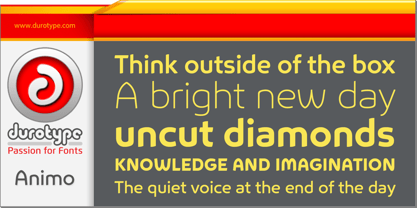
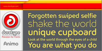
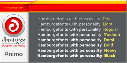
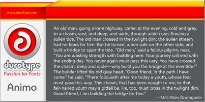
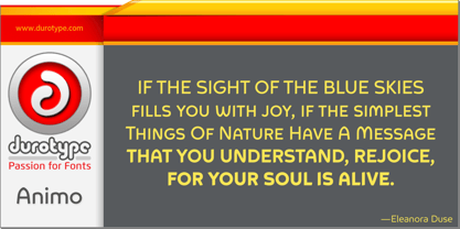
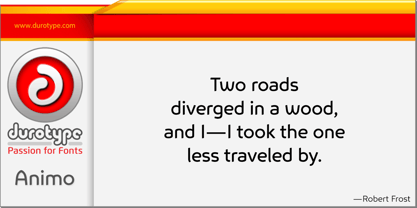
Animo stands out from the crowd. Animo is surprisingly legible for its outspoken personality. Many of Animo’s small details were crafted to enhance its legibility, while preserving its personality.
Animo is suitable for both text and display use — for graphic design, corporate identity design, magazines, reports, editorials, web, advertising, signage, etc.
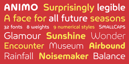
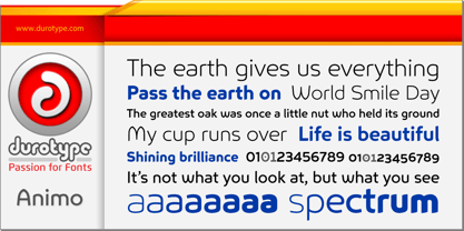
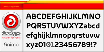
Animo includes 32 fonts, 8 weights, 16 uprights, and matching italics. Animo provides nine numerical styles: lining and oldstyle figures (proportional and tabular), small cap figures, superiors, inferiors, numerators, and denominators. Animo provides small caps, arbitrary fractions, and extensive language support. Animo Alt provides a more usual shape for the ‘A’, ‘M’, ‘W’, and ‘w’.
For more information about Animo, download the PDF Specimen Manual.
Designers: Ben Blom
Publisher: Durotype
Foundry: Durotype
Design Owner: Durotype
MyFonts debut: Nov 25, 2015
Animo™
is a trademark of Durotype.
About Durotype
Durotype is an innovative font foundry based in Best, The Netherlands. It has been founded by Ben Blom in 2010. All Durotype fonts are created out of passion for the design involved. They are crafted in a long process of creation and improvement, until the right fusion of the functional and esthetical has been achieved. With whatever passion they are created—Durotype fonts are, in the end, just high-quality tools with a bit of pizzazz. Most of them are rather universal tools: their design doesn’t determine any specific uses. Many of them are very versatile: they have many styles and many glyphs. Many of them are, given their design, crafted in a way to maximize their legibility. Durotype fonts are meant to be durable: in many years from now, they should be just as enjoyable and useful as they are today. Durotype fonts have been deployed successfully in many areas. In financial services, entertainment, and museums. In television, marketing, and corporate identities. In technology, sports, automotive, and real estate. In food, retail, B2B, and health. In e-books, apps, ATMs, and video phones. In web sites, catalogs, signage, and packaging. Et cetera. Durotype’s most successful fonts are Flexo, a squarish design (MyFonts Most Popular Fonts of 2012), and Aspira, a legible geometric family with a very big number of styles. Flexo in use: 1 2 3 4 5 6 7 8 9 10 11 12 13. Aspira in use: 1 2 3 4 5 6 7 8 9 10.
Read more
Read less
- Choosing a selection results in a full page refresh.