Select this license type when you are developing an app for iOS, Android, or Windows Phone, and you will be embedding the font file in your mobile application's code.
Dai Vernon
by E-phemera

- Aa Glyphs
-
Best ValueFamily Packages
- Individual Styles
- Tech Specs
- Licensing
Per style:
$17.50
Pack of 2 styles:
$35.00
About Dai Vernon Font Family
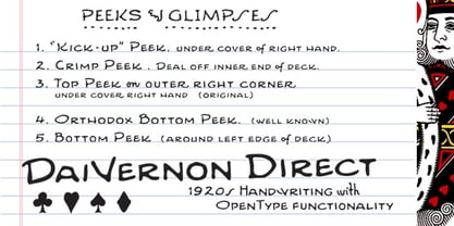
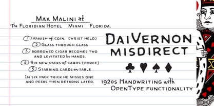
DaiVernon is based on the handwriting of card magician extraordinaire Dai Vernon. Known as "The Professor", Vernon was a beloved expert in sleight-of-hand and card magic. These fonts are based on the penmanship in his notebooks from the 1920s, which feature almost no lowercase letters. DaiVernon Direct is based on what appears to be his hastier style, while DaiVernon Misdirect is based on his neater hand. Numerous OpenType bonus glyphs, contextual alternates and discretionary ligatures help to create the feel of his handwriting. Thanks go to Michael Albright, David Ben, and Gene Matsuura for helping to provide access to Vernon's notebooks.
Designers: Andrew Leman, Dai Vernon
Publisher: E-phemera
Foundry: E-phemera
Design Owner: E-phemera
MyFonts debut: Feb 26, 2010
About E-phemera
E-phemera fonts are meant to revive type from years gone by in a way which captures the feeling of pre-digital printing technology. Most of the fonts in the collection were first developed for private use in designing vintage prop documents for movies and television shows. E-phemera fonts are inspired by old printed and hand-lettered material, and are usually designed a little rough and a little irregular, in deliberate defiance of the crisp perfection and merciless uniformity of modern digital fonts. Multiple letterforms and ligatures are provided, when possible and practical. We here at E-phemera fonts love computers and wouldn't do without them, but we also wish to remember and celebrate the days when every letter was an individual piece of metal or wood, and not just a collection of BCP data. Print is dead. Long live print!
Read more
Read less
- Choosing a selection results in a full page refresh.