Select this license type when you are developing an app for iOS, Android, or Windows Phone, and you will be embedding the font file in your mobile application's code.
Fishwrapper
by E-phemera


- Aa Glyphs
-
Best ValueFamily Packages
- Individual Styles
- Tech Specs
- Licensing
Per style:
$16.66
Pack of 3 styles:
$50.00
About Fishwrapper Font Family
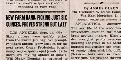
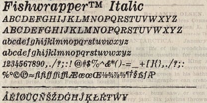
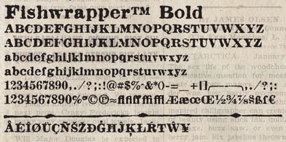
Fishwrapper is a three-member font family (Regular, Bold, and Italic) designed to replicate the look of authentic vintage newspaper typography. The fonts are rough and are meant to be used at newspaper sizes. All three fonts have a complete alternate alphabet built in: using the contextual alternates feature will automatically substitute alternate versions of most glyphs, so that identical characters do not appear side by side, thus helping to create the look of metal type. Fishwrapper Regular has a complete set of small caps built in. Each font features assorted rule lines and other decorative material, many accessible through the discretionary ligature OpenType feature (three em dashes in a row, for example, will become a rule line), as well as fractions and a full international character set. Used in conjunction with some of E-phemera's vintage headline fonts, the Fishwrapper family is intended as a complete vintage newspaper and job-printing type solution.
Designers: Andrew Leman
Publisher: E-phemera
Foundry: E-phemera
Design Owner: E-phemera
MyFonts debut: Oct 2, 2012
About E-phemera
E-phemera fonts are meant to revive type from years gone by in a way which captures the feeling of pre-digital printing technology. Most of the fonts in the collection were first developed for private use in designing vintage prop documents for movies and television shows. E-phemera fonts are inspired by old printed and hand-lettered material, and are usually designed a little rough and a little irregular, in deliberate defiance of the crisp perfection and merciless uniformity of modern digital fonts. Multiple letterforms and ligatures are provided, when possible and practical. We here at E-phemera fonts love computers and wouldn't do without them, but we also wish to remember and celebrate the days when every letter was an individual piece of metal or wood, and not just a collection of BCP data. Print is dead. Long live print!
Read more
Read less
- Choosing a selection results in a full page refresh.