Select this license type when you are developing an app for iOS, Android, or Windows Phone, and you will be embedding the font file in your mobile application's code.
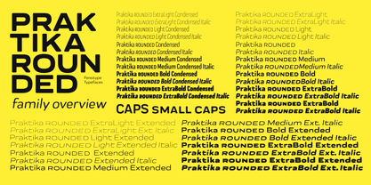
Praktika Rounded
by Fenotype
Individual Styles from $0.00
Complete family of 40 fonts: $249.00


Praktika Rounded Font Family was
designed by
Emil Karl Bertell,
Teo Tuominen and
published by
Fenotype. Praktika Rounded contains
40
styles and family package options.
More about this family
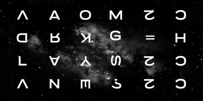
- Aa Glyphs
-
Best ValueFamily Packages
- Individual Styles
- Tech Specs
- Licensing
Praktika Round Regular Family
14 fontsPer style:
$7.78
Pack of 14 styles:
$109.00
Praktika Round Extended Family
14 fontsPer style:
$7.78
Pack of 14 styles:
$109.00
Praktika Round Condensed Family
12 fontsPer style:
$7.41
Pack of 12 styles:
$89.00
About Praktika Rounded Font Family
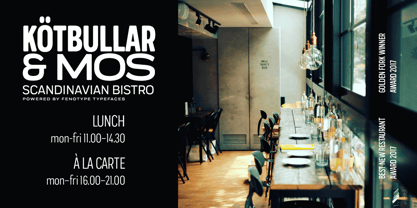
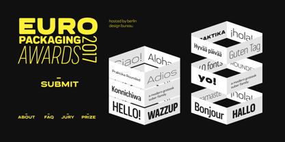
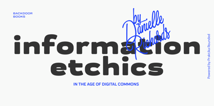
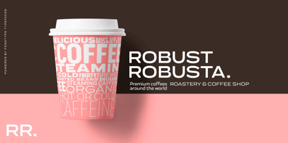
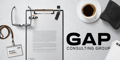
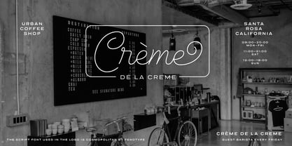
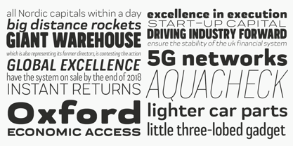
Contemporary grotesk super family If you happened to sleep on Praktika – the previous bestseller of Fenotype – don't worry, as here's its new rounded counterpart. Perhaps even more functional than its predecessor, Praktika rounded has a distinct look & feel of its own – rather contemporary and urban than classicist. Praktika Rounded shares the same seven weights and three widths found in the original Praktika family, as well as the same familiar Open Type features: • Built-in small capitals • Both lining and old style numerals, in tabular or proportional form • Superscript and subscript numerals • Many alternate characters However, if you can't decide on whether you should get original Praktika or the rounded version, they are also available as a bundle for a rather lucrative price.
Designers: Emil Karl Bertell, Teo Tuominen
Publisher: Fenotype
Foundry: Fenotype
Design Owner: Fenotype
MyFonts debut: Nov 15, 2017
Praktika Rounded
About Fenotype
Emil Bertell has done it all. Having published his first font files at 16, he was considered to be an international free-font hero while still in his teens. He went on to attend design college, drop out, and become a well-known graphic designer and illustrator. Now one of the most successful type designers from the Nordic countries on MyFonts, the Finland-based designer said in his Creative Characters interview that he’s “had an obsession with visual culture from the beginning.” Before turning his attention to type design full-time, Emil had a very successful career as an award-winning illustrator. “Illustration became my main livelihood,” he said. “I drew painstaking pencil illustrations for magazines, advertising, stamps, etc. I often designed my own fonts for festivals and hand-drew the lettering posters; I also did a few pencil illustrations based on lettershapes, and that got out of hand, so I had to do a lot more of them.” In 2012 he finally made the switch and committed all of his time to type design. Emil first saw success with his Billboard typeface. “It became my first Rising Star on MyFonts and made me realize that I could actually make a living by designing fonts,” he said. “I realized that there’s actually a market out there that I could become a part of.” Throughout the rest of that year he began to see even more success. It began in January, when his font, Mishka, was featured in our Most Popular Fonts of 2011 list. He went on to find a way to bookend the year and was listed among the Most Popular Fonts of 2012 with his Mercury Script design. Since then, his foundry’s success has continued on with best sellers like Voyage and The Carpenter. Fans of the foundry have a lot to look forward to in the near future. Emil will continue to produce beautiful scripts (some coming soon to MyFonts!) and has plans to expand his business.
Read more
Read less
- Choosing a selection results in a full page refresh.