Select this license type when you are developing an app for iOS, Android, or Windows Phone, and you will be embedding the font file in your mobile application's code.
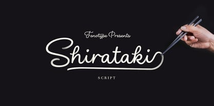
Shirataki™
by Fenotype
Individual Styles from $30.00
35% Off


Shirataki Font Family was
designed by
Emil Karl Bertell and
published by
Fenotype. Shirataki contains
1
styles.
More about this family
About Shirataki Font Family
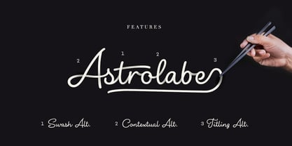
Shirataki is a soft pen script with clear round letter shapes and large display capitals. Shirataki has really low contrast -it’s almost monolinear. Shirataki is a clear and friendly display script ideal for logo, signature, packaging, poster or headline purposes. Shirataki uses Contextual Alternates to keep the connections smooth and it has Swash alternates for every standard letter. There’s even more alternates in glyph palette. There’s also a set of swash endings coded in Titling Alternates and set in lowercase letters. In addition there’s a selection of strokes set in uppercase A-H. Shirataki is PUA encoded so you can access extras in most graphic design softwares even without OpenType support. In case you were wondering Shirataki are Japanese yam noodles. Enjoy!
Designers: Emil Karl Bertell
Publisher: Fenotype
Foundry: Fenotype
Design Owner: Fenotype
MyFonts debut: May 29, 2018
Shirataki™
is a trademark of Fenotype Typefaces.
About Fenotype
Emil Bertell has done it all. Having published his first font files at 16, he was considered to be an international free-font hero while still in his teens. He went on to attend design college, drop out, and become a well-known graphic designer and illustrator. Now one of the most successful type designers from the Nordic countries on MyFonts, the Finland-based designer said in his Creative Characters interview that he’s “had an obsession with visual culture from the beginning.” Before turning his attention to type design full-time, Emil had a very successful career as an award-winning illustrator. “Illustration became my main livelihood,” he said. “I drew painstaking pencil illustrations for magazines, advertising, stamps, etc. I often designed my own fonts for festivals and hand-drew the lettering posters; I also did a few pencil illustrations based on lettershapes, and that got out of hand, so I had to do a lot more of them.” In 2012 he finally made the switch and committed all of his time to type design. Emil first saw success with his Billboard typeface. “It became my first Rising Star on MyFonts and made me realize that I could actually make a living by designing fonts,” he said. “I realized that there’s actually a market out there that I could become a part of.” Throughout the rest of that year he began to see even more success. It began in January, when his font, Mishka, was featured in our Most Popular Fonts of 2011 list. He went on to find a way to bookend the year and was listed among the Most Popular Fonts of 2012 with his Mercury Script design. Since then, his foundry’s success has continued on with best sellers like Voyage and The Carpenter. Fans of the foundry have a lot to look forward to in the near future. Emil will continue to produce beautiful scripts (some coming soon to MyFonts!) and has plans to expand his business.
Read more
Read less
- Choosing a selection results in a full page refresh.