About Bradley Chancery Font Family
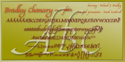
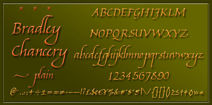
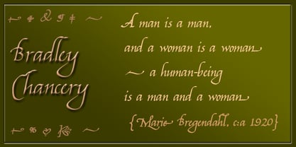
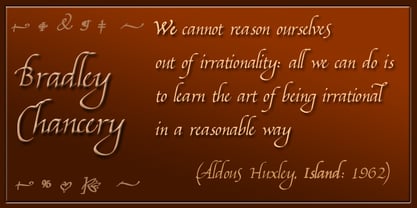
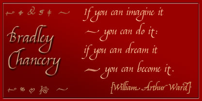
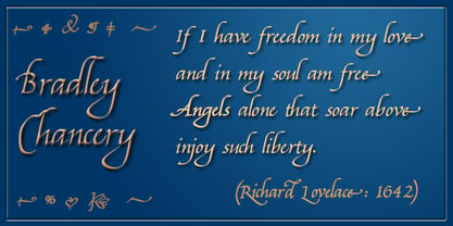
A new font in the Humanistic tradition, for letters, poetry, display graphics - and just to make the everyday more elegant.
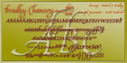
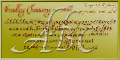
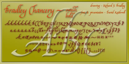
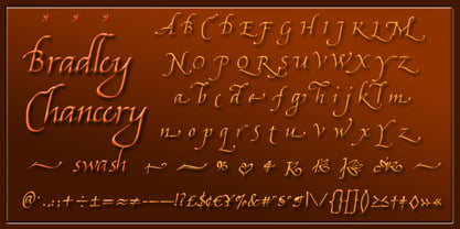
This family of fonts has four members: the basic plain font has regular and bold weights, and each of those has its swash variant (labelled 'italic') which you can use to replace single letters giving a dash of spice at the beginning or end of a word, phrase or line. Of course you *can* use the swash forms together, but it's a pretty stressful effect and that's not our idea!
Richard Bradley writes:
My inspiration for this font was the wonderful Humanistic Cursive writing of such 15th and 16th century Italian writing masters as Giambattista Palatino and Giovanantonio Tagliente as well as Bartholomew Dodington, who, as Regius Professor of Greek at Cambridge University wrote Latin, Greek and other languages in a singularly beautiful example of the Italian cursive style.
The letters were written using a Parker Frontier fountain pen fitted with the excellent Parker bold italic steel nib. I wrote the letters on old computer print-out paper with regular bands across it. The x-height (the height of a, c, e etc) is two-thirds of the capital height, with rather long ascenders (b, h) and descenders (g, y), following the proportions of the original writing in the early manuscripts and emulating the fine writing of those wonderful early scribes.
We trust that this font will prove useful to folk for a wide variety of typographic needs in its bold and regular weights and the with added extra Swash font, which again follows the early masters, in adding extra flow and decoration to any wording set in this new font.
I wanted to make available a hand-written font in that style for use today using the modern digitising process which was completed by David Kettlewell from my scans of the original hand-written letters.
While the capitals are only 50% higher than the lower-case letters in this style, the ascenders and descenders are much longer than is normal in other styles. We have set the the space between the lines (the 'leading', traditionally marked by pieces of lead) so that the lines don't run foul of one another, but depending on how much text you set in this type and how it sits, you might choose to set the lines closer together in your word processor, layout, or graphics programme.
Instead of swash variants of the numbers, there is a selection of ornaments.
There is a video to show how you might use the swash capitals and finals, as well as more examples at New Renaissance Fonts.
Bradley Chancery
About New Renaissance Fonts
New Renaissance: The reclaiming of one baby that got thrown out with the bath water in today’s technological revolution – the good aspects of yesterday’s ways of doing things, how things that work well can also be beautiful and feel good, how a rich variety of different skills can illuminate one another, how the arts can achieve amazing effects on the way people behave, how musical and artistic harmony can be a model for human harmony...
David Kettlewell is a harper, renaissance musicologist and conductor to illuminate his work with text and type. As his early inspirations, he quotes poring over facsimiles of Books of Hours, singing from renaissance music manuscripts, and an old and dog-eared Letraset catalogue that was his constant companion.
“We're anyway surrounded by an awful lot of stuff we've written, and it doesn't take much more time to make sure that it's something you feel good looking at, and it makes the quality of life so much greater.”
David’s work with digital type started with the enchanted discovery of the programme Fontographer hidden away inside the Freehand Graphic Studio, and has lately been delighted to progress to the empowering world surrounding its successor, FontLab Studio.
Richard Bradley, already an established name in the world of fonts (Bradley Hand, Calligraphic Ornaments, Fine Hand, Bible Script in the Linotype, ITC and Letraset catalogues), encouraged David to publish his own work and to develop digitally Rick’s new paper designs; and so New Renaissance Fonts was formed.
The emphasis is on original calligraphic and decorative fonts, firmly rooted in the Renaissance tradition of hand-measured beauty and human balance, but completely up to date for today’s needs. The initial designs are by Rick, David and others in his circle, while the creation of the digital fonts is done by David. The New Renaissance Fonts web-site gives examples of these fonts in use, as well as offering two dozen other fonts for free download as long as they’re still not quite ready for commercial release: as a complement to it, the Fontografia web-site provides stories and hints about ways of using fonts, ways of making fonts, ways of enjoying fonts.
Read more
Read less
