Select this license type when you are developing an app for iOS, Android, or Windows Phone, and you will be embedding the font file in your mobile application's code.
Sintesi Serif™
by FSdesign-Salmina
Individual Styles from $0.00
Complete family of 22 fonts: $149.00

Sintesi Serif Font Family was
designed by
Filippo Salmina and
published by
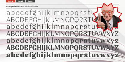
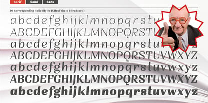
FSdesign-Salmina. Sintesi Serif contains
22
styles and family package options.
More about this family
- Aa Glyphs
-
Best ValueFamily Packages
- Individual Styles
- Tech Specs
- Licensing
Sintesi Serif Complete
20 fontsPer style:
$7.45
Pack of 20 styles:
$149.00
About Sintesi Serif Font Family
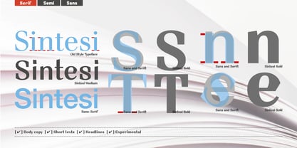
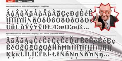
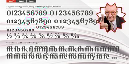
Sans meets serif. Would you like to express tradition by using a contemporary font? Sintesi might be exactly what you are looking for. Sintesi stands for synthesis: the unification of serif and sans-serif into a contemporary font, which surprises with different facets depending on its application. In copy size Sintesi performs like a sans-serif. It is a compact and well readable font that fulfills all requirements of modern digital media. In larger sizes, Sintesi unfolds its traditional character. Now, its strong contrast and the perceptible feather-ductus stand out clearly, as we appreciate it in a historical old style face. Sintesi is completed by a suitable italic. Its cursive character has more to do with writing-speed than to moderate inclination. Therefore Sintesi may be well-suited for many other purposes, not only for emphasis. The whole font family consists of 20 styles and offers a wide range of Western and Eastern European special characters, typographical ligatures, uppercase, oldstyle and fraction figures. Sintesi (Serif) builds together with
and
an extended family. Start combining antiquity with modernity!
Download a free trial version of Sintesi
with a reduced character set. Check it out!
Designers: Filippo Salmina
Publisher: FSdesign-Salmina
Foundry: FSdesign-Salmina
Design Owner: FSdesign-Salmina
MyFonts debut: Jan 7, 2010
Sintesi Serif™
is a trademark of FSdesign-Salmina.
About FSdesign-Salmina
FS Design offers original typaces that you would not necessarily expect under the term “Swiss Design”. Nowadays, practically the same, more or less “accurate” variants of the Helvetica font are re-proposed again and again in the Swiss font design scene. Terms like “readability” or “functionning” are often misused to justify this form of conformism. We do not appreciate this development and see it as a form of flattening. Even Adrian Frutiger and Hans Eduard Meier, the intellectual fathers of the Swiss school, have shown more independence and courage with their projects “Avenir” and “Syntax”. With our work we want to prove that another way is possible.FS Design is a Swiss label with a neat and unique assortment of creative styles and types. All font-families are technologically state-of-the-art developments, accurately drawn and proper in their technical realization. The well developed font-families include a large amount of font styles as well as special characters of both Eastern and Western European languages, typographical ligatures and figure sets. Their accurate metrics and kerning ensure an homogenous text color. The technically up-to-date OpenType format allows the support of several OpenType features. FS Design was founded in 2005 by Filippo Salmina, a Swiss designer with a deep passion for original and perfectly shaped fonts.
Read more
Read less
- Choosing a selection results in a full page refresh.