Select this license type when you are developing an app for iOS, Android, or Windows Phone, and you will be embedding the font file in your mobile application's code.
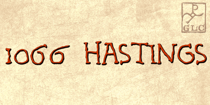
1066 Hastings
by GLC
Individual Styles from $38.00

1066 Hastings Font Family was
designed by
published by
GLC. 1066 Hastings contains
1
styles.
More about this family
About 1066 Hastings Font Family
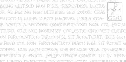
In 1066, William, duke of Normandy, was invading England. He was demanding the crown for himself, against King Harold the Saxon. He killed Harold and reached the crown at Hastings, the well-known battlefield. A few years later, in Bayeux (Normandy, French)was displayed a large tapestry (almost 70 m long) who was telling the story of the conquest. Along the tapestry was written a comment in Latin, using Roman capitals influenced a little by English or Scandinavian style (as it is visible in the Eth character). We have created the font, inspired from this design, adapted for contemporary users, making difference between U and V, I and J, which has not any relevance for ancient Latin scribes, and naturally with Thorn, Oslash, Lslash... and usual accented characters did not exist at the time. We also have reconstructed the K, German double s and Z, always using patterns of the time. We have scrupulously respected the poetic irregular and distressed original forms with two or three alternate for each characters, including reconstructed numerals.
1066 Hastings

About GLC
Gilles Le Corre was born in 1950 in Nantes, France. Painter since the end of 70s, he is also an engraver and calligrapher. He has been learning about medieval art and old books for as long as he can remember. More recently he has made the computer a tool for writing like the quill pen and ink. With it, he aims to make it possible to print books that look just like old ones! Beginning in 2007 he has been trying to reproduce, very exactly, a wide range of historic European typefaces, mainly from medieval and early periods of printing - his favorite period - from 1456 with Gutenberg, up to 1913 with a font inspired by a real old typewriter.
Read more
Read less
- Choosing a selection results in a full page refresh.