Select this license type when you are developing an app for iOS, Android, or Windows Phone, and you will be embedding the font file in your mobile application's code.
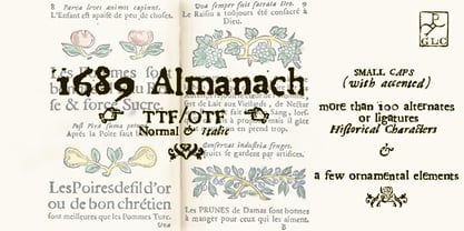
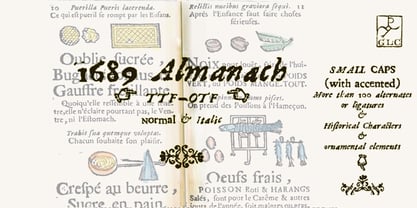
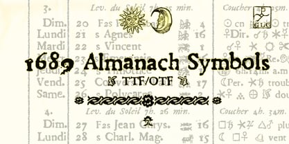
1689 Almanach
by GLC
Individual Styles from $15.00
Complete family of 5 fonts: $65.00
1689 Almanach Font Family was
designed by
published by
GLC. 1689 Almanach contains
1
styles and family package options.
More about this family
- Aa Glyphs
-
Best ValueFamily Packages
- Individual Styles
- Tech Specs
- Licensing
-
1689 Almanach Normal
-
1689 Almanach Italic
-
1689 Almanach Supplement Normal
-
1689 Almanach Supplement Italic
Per style:
$13.00
Pack of 5 styles:
$65.00
-
-
Per style:
$19.00
Pack of 2 styles:
$38.00
-
1689 Almanach Normal
-
1689 Almanach Supplement Normal
Per style:
$19.00
Pack of 2 styles:
$38.00
-
1689 Almanach Italic
-
1689 Almanach Supplement Italic
Per style:
$19.00
Pack of 2 styles:
$38.00
-
-
Per style:
$19.00
Pack of 2 styles:
$38.00
About 1689 Almanach Font Family
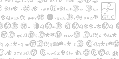
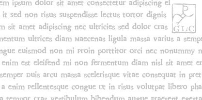
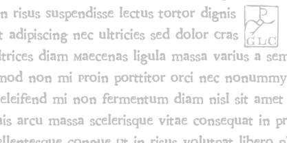
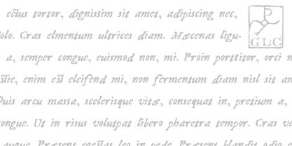
This family was inspired by the eroded and tired fonts used by printers from the sixteenth century to the early years of twentieth for cheap or fleeting works, like almanacs, adverts, gazettes or popular novels. This font is partially derived from a dirty Garamond used to print a small school booklet for children, in Dijon (France) circa 1689. There are two styles: Normal and Italic, with small caps and lower cases alternates added and a few fleurons from the same printer. Its original cap height is about seven millimeters. Decorated letters like 1512 Initials, 1550 Arabesques, 1565 Venetian or 1584 Rinceau from GLC Foundry, can be used with this family without anachronism.
1689 Almanach

About GLC
Gilles Le Corre was born in 1950 in Nantes, France. Painter since the end of 70s, he is also an engraver and calligrapher. He has been learning about medieval art and old books for as long as he can remember. More recently he has made the computer a tool for writing like the quill pen and ink. With it, he aims to make it possible to print books that look just like old ones! Beginning in 2007 he has been trying to reproduce, very exactly, a wide range of historic European typefaces, mainly from medieval and early periods of printing - his favorite period - from 1456 with Gutenberg, up to 1913 with a font inspired by a real old typewriter.
Read more
Read less
- Choosing a selection results in a full page refresh.