Select this license type when you are developing an app for iOS, Android, or Windows Phone, and you will be embedding the font file in your mobile application's code.
Graviola Soft
by Harbor Type
Individual Styles from $0.00
Complete family of 16 fonts: $160.00

Graviola Soft Font Family was
designed by
Henrique Beier and
published by
Harbor Type. Graviola Soft contains
16
styles and family package options.
More about this family
- Aa Glyphs
-
Best ValueFamily Packages
- Individual Styles
- Tech Specs
- Licensing
Graviola Soft Complete Family
16 fontsPer style:
$9.37
Pack of 16 styles:
$150.00
About Graviola Soft Font Family
🏆 Selected for the 12th Biennial of Brazilian Graphic Design.
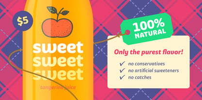
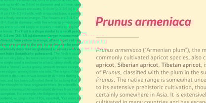
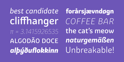
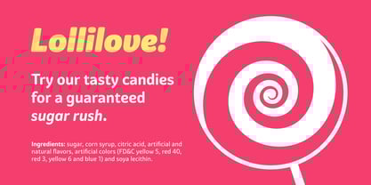
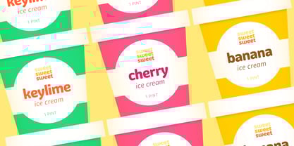
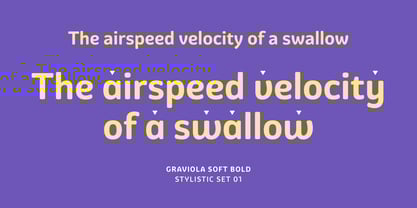
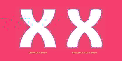
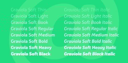
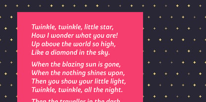
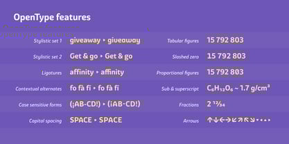
Graviola Soft is a juicy type family. It is based on our Graviola typeface, but we didn’t just round its corners. We redrew every stem and terminal so they would look just right. Combined with curved diagonal strokes and alternate glyphs, Graviola Soft makes for a super friendly typeface. The family consists of 16 fonts, from Thin to Black and matching italics. While the intermediate ones work for body text, the extreme weights look specially beautiful at display sizes. Each font contains 530+ glyphs, supporting more than 90 languages. Stylistic sets provide alternates in two groupings (a, v, w, y and G, g, &). We think Graviola Soft works best on packaging, logotypes and headlines, but we’re eager to see what else you can do with it.
Designers: Henrique Beier
Publisher: Harbor Type
Foundry: Harbor Type
Design Owner: Harbor Type
MyFonts debut: Mar 26, 2016
Graviola Soft
About Harbor Type
Harbor Type is an independent type foundry based in the city of Porto Alegre, Brazil. It is run by Henrique Beier, graphic designer by major, type designer by heart. I develop typefaces for retail and provide font production services to other foundries and type designers. The foundry was started in 2014 with the release of Densia Sans. First available on a pay-what-you-want basis, it was well received by the public and inspired me to pursue designing typefaces for a living. Later on came Graviola, Garibaldi, Malva and others. Along the way I learned that fonts are more than just nice letterforms. They stand at the crossroads of design and technology, which is why I also pay special attention to the technical aspects of typography.
Read more
Read less
- Choosing a selection results in a full page refresh.