Select this license type when you are developing an app for iOS, Android, or Windows Phone, and you will be embedding the font file in your mobile application's code.
Watchmaker™
by Ingrimayne Type
Individual Styles from $5.95
Complete family of 2 fonts: $7.95

Watchmaker Font Family was
designed by
Robert Schenk and
published by
Ingrimayne Type. Watchmaker contains
2
styles and family package options.
More about this family
- Aa Glyphs
-
Best ValueFamily Packages
- Individual Styles
- Tech Specs
- Licensing
Per style:
$3.97
Pack of 2 styles:
$7.95
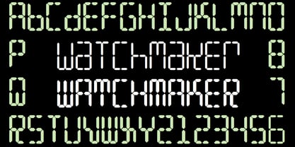
About Watchmaker Font Family
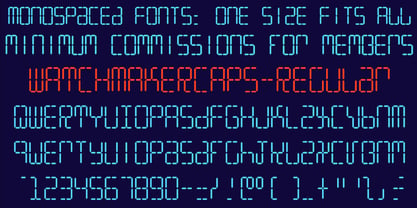
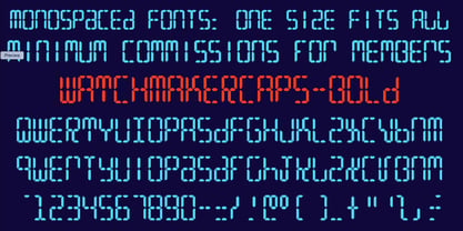
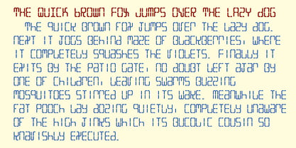
Watchmaker was designed with the limitations imposed by a simple LCD that is meant only to display numbers. Most LCD typefaces use some diagonals to make the letters look better. This one does not and from it you can see why a few diagonals are needed to display letters on a LCD. Watchmaker is monospaced and comes in plain and bold weights.
Designers: Robert Schenk
Publisher: Ingrimayne Type
Foundry: Ingrimayne Type
Design Owner: Ingrimayne Type
MyFonts debut: Jan 8, 2003
Watchmaker™
is a trademark of Ingrimayne Type.

About Ingrimayne Type
IngrimayneType distributes digital typefaces designed by Robert Schenk. Robert became fascinated with type design in the late 1980s and began designing type in 1988 with an early version of Fontographer. He has designed a wide variety of typefaces, from standard text fonts to bizarre decorative faces. Many of these faces were designed to meet specific needs but others were experimental, designed as a challenge to form letters that met a narrowly-defined criteria. Areas of special strength in the IngrimayneType library include novelty fonts, picture fonts including tessellations, and fonts with alternating character sets.
Read more
Read less
- Choosing a selection results in a full page refresh.