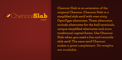
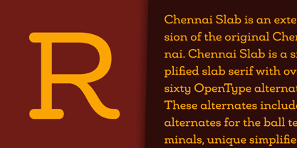
Chennai Slab Norm Thin
Chennai Slab Norm Thin Oblique
Chennai Slab Norm Light
Chennai Slab Norm Light Oblique
Chennai Slab Norm Book
Chennai Slab Norm Book Oblique
Chennai Slab Norm Regular
Chennai Slab Norm Regular Oblique
Chennai Slab Norm Medium
Chennai Slab Norm Medium Oblique
Chennai Slab Norm Demi
Chennai Slab Norm Demi Oblique
Chennai Slab Norm Bold
Chennai Slab Norm Bold Oblique
Chennai Slab Norm Ex Bold
Chennai Slab Norm Ex Bold Oblique
Chennai Slab Norm Black
Chennai Slab Norm Black Oblique
Chennai Slab Extended Thin
Chennai Slab Extended Thin Oblique
Chennai Slab Extended Light
Chennai Slab Extended Light Oblique
Chennai Slab Extended Book
Chennai Slab Extended Book Oblique
Chennai Slab Extended Regular
Chennai Slab Extended Regular Oblique
Chennai Slab Extended Medium
Chennai Slab Extended Medium Oblique
Chennai Slab Extended Demi
Chennai Slab Extended Demi Oblique
Chennai Slab Extended Bold
Chennai Slab Extended Bold Oblique
Chennai Slab Extended Ex Bold
Chennai Slab Extended Ex Bold Oblique
Chennai Slab Extended Black
Chennai Slab Extended Black Oblique
Chennai Slab Condensed Thin
Chennai Slab Condensed Thin Oblique
Chennai Slab Condensed Light
Chennai Slab Condensed Light Oblique
Chennai Slab Condensed Book
Chennai Slab Condensed Book Oblique
Chennai Slab Condensed Regular
Chennai Slab Condensed Regular Oblique
Chennai Slab Condensed Medium
Chennai Slab Condensed Medium Oblique
Chennai Slab Condensed Demi
Chennai Slab Condensed Demi Oblique
Chennai Slab Condensed Bold
Chennai Slab Condensed Bold Oblique
Chennai Slab Condensed Ex Bold
Chennai Slab Condensed Ex Bold Oblique
Chennai Slab Condensed Black
Chennai Slab Condensed Black Oblique