Select this license type when you are developing an app for iOS, Android, or Windows Phone, and you will be embedding the font file in your mobile application's code.
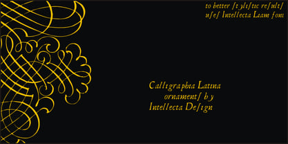
CalligraphiaLatina
by Intellecta Design
Individual Styles from $24.90
25% Off

CalligraphiaLatina Font Family was
designed by
Paulo W and
published by
Intellecta Design. CalligraphiaLatina contains
1
styles.
More about this family
About CalligraphiaLatina Font Family
One of the most successful new ornament fonts is CalligraphiaLatina. It is part of a trend that's been quite popular lately: messed-up calligraphy. You can dirty up (or "deconstruct") gracious classic-looking curves in many ways: using a variety of software filters; by superimposition; or even by hand. Brazilian designer Paulo W has his own method, possibly involving a scanner and some auto-tracing. The result works well when you want that worn-down grungy look, combining CalligraphiaLatina ornaments with the equally wobbly Liam. Source : Rising Stars February 2008.
Designers: Paulo W
Publisher: Intellecta Design
Foundry: Intellecta Design
Design Owner: Intellecta Design
MyFonts debut: Jan 3, 2008
CalligraphiaLatina
About Intellecta Design
Intellecta Design is a Brazilian typefoundry interested in typographical research and revivals of all forms of ancient typefaces and handwriting styles. It searches historical churches, museums, antiquaries and similar institutions to develop fonts from old books and documents, and has a large collection of rare catalogues and books from XVI to XIX century to help in your studies to digitize lost fonts and non-usual handwriting script models. This kind of research is not common in Brazil. In addition, its design team also works to create new and modern typefaces for all applications. Intellecta Design claims to be the creator and owner of the largest typeface library in Latin America.
Read more
Read less
- Choosing a selection results in a full page refresh.