Select this license type when you are developing an app for iOS, Android, or Windows Phone, and you will be embedding the font file in your mobile application's code.
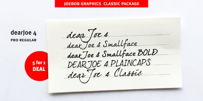
DearJoe 4
by JOEBOB graphics
Individual Styles from $19.00
Complete family of 8 fonts: $39.00
DearJoe 4 Font Family was
designed by
Jeroen “Joebob” van der Ham and
published by
JOEBOB graphics. DearJoe 4 contains
5
styles and family package options.
More about this family
- Aa Glyphs
-
Best ValueFamily Packages
- Individual Styles
- Tech Specs
- Licensing
Per style:
$4.87
Pack of 8 styles:
$39.00
About DearJoe 4 Font Family
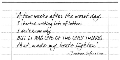
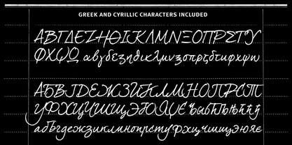
DearJoe 4 was made around 2005 as the fourth in a list of fonts that I revisit every once in a while in an attempt to create something that comes as close as possible to my own handwriting at that time. As my handwriting evolves, so does the font and the later versions all include new features such as new special signs and Cyrillic and Greek glyph sets. DearJoe 4 comes as a set of 5 fonts: The regular version, which has a bit jagged edges just like one would see when looking at ballpoint writing up close, a Plaincaps version, a Smallface version (also in Bold) and the first (classic) render of the font which is the least doctored and has the roughest edges. These 5 fonts come together as a Classic package.
Designers: Jeroen “Joebob” van der Ham
Publisher: JOEBOB graphics
Foundry: JOEBOB graphics
Design Owner: JOEBOB graphics
MyFonts debut: Feb 21, 2006
DearJoe 4

About JOEBOB graphics
At JOEBOB graphics we like to write. And we like to keep it real.We create our handwritten fonts in such a way that they end up looking like handwriting, not like polished scripts. We do so because we think it’s a good idea to establish a natural feel to our fonts and aim for character and intention over perfection. Little flaws we make while writing are welcomed and left in on purpose because we think it contributes to the idea of being human in an increasingly digital world.Foundry of Jeroen “Joebob” van der Ham.
Read more
Read less