Select this license type when you are developing an app for iOS, Android, or Windows Phone, and you will be embedding the font file in your mobile application's code.
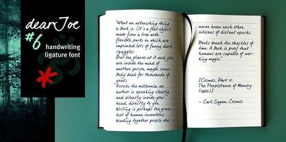
DearJoe 6
by JOEBOB graphics
Individual Styles from $25.00

DearJoe 6 Font Family was
designed by
Jeroen “Joebob” van der Ham and
published by
JOEBOB graphics. DearJoe 6 contains
1
styles.
More about this family
About DearJoe 6 Font Family
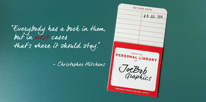
The dearJoe series of fonts had it’s origin somewhere around 1999, the year I created dearJoe 1, which was a first (and half-assed) attempt at converting my own handwriting into a working font. Being able to type in my own handwriting had always been a childhood fantasy, and even though I only partly understood the software, a working font was generated and I decided to put it on the internet for people to use.
And that’s what they did: at this moment the dearJoe 1 font has been downloaded millions of times and can be found on just about anything, ranging from Vietnamese riksjas, a Tasmanian gym to a fancy chocolate store on 5th Avenue.
The font is not something I am particularly proud of, but it started me of in building what later became the JOEBOB graphics font foundry.
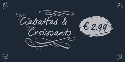
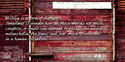
Inbetween creating other fonts, the dearJoe series has become a theme I revisit every once in a while, trying to create an update on how my handwriting evolved, along with my abilities in creating fonts that mimic actual handwriting. In the last decade or so I started implementing ligatures and alternate characters, which helped a lot in making something that can almost pass for actual handwriting.
Designers: Jeroen “Joebob” van der Ham
Publisher: JOEBOB graphics
Foundry: JOEBOB graphics
Design Owner: JOEBOB graphics
MyFonts debut: Jun 20, 2014
DearJoe 6

About JOEBOB graphics
At JOEBOB graphics we like to write. And we like to keep it real.We create our handwritten fonts in such a way that they end up looking like handwriting, not like polished scripts. We do so because we think it’s a good idea to establish a natural feel to our fonts and aim for character and intention over perfection. Little flaws we make while writing are welcomed and left in on purpose because we think it contributes to the idea of being human in an increasingly digital world.Foundry of Jeroen “Joebob” van der Ham.
Read more
Read less