Select this license type when you are developing an app for iOS, Android, or Windows Phone, and you will be embedding the font file in your mobile application's code.
Altivo™
by Kostic
Individual Styles from $40.00
Complete family of 16 fonts: $320.00

Altivo Font Family was
designed by
Nikola Kostić and
published by
Kostic. Altivo contains
16
styles and family package options.
More about this family
- Aa Glyphs
-
Best ValueFamily Packages
- Individual Styles
- Tech Specs
- Licensing
Altivo Basic Family
6 fontsPer style:
$26.66
Pack of 6 styles:
$160.00
About Altivo Font Family
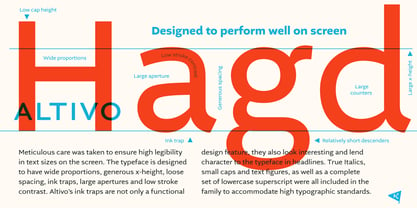
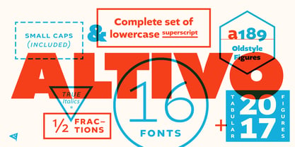
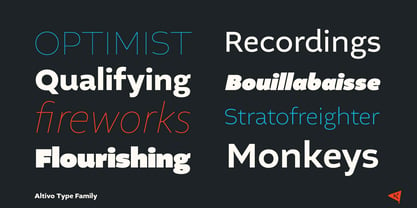
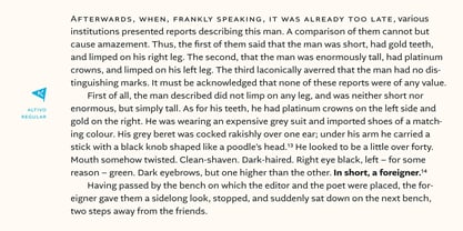
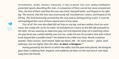
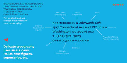
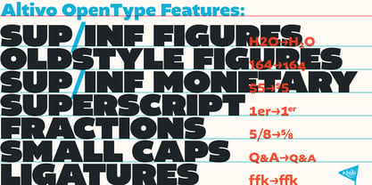
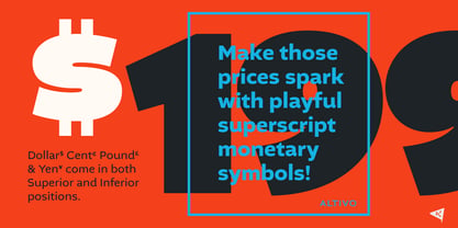
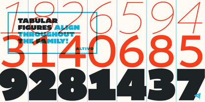
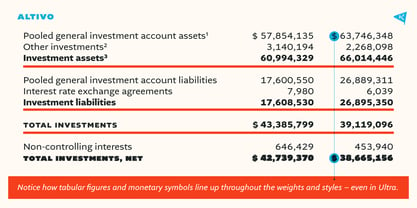
Altivo is a proper workhorse sans serif. Sixteen OpenType fonts in eight weights (with true Italics) range from Thin to Ultra. Meticulous care was taken to ensure high legibility in text sizes on the screen. The typeface is designed to have wide proportions, generous x-height, loose spacing, ink traps, large apertures and low stroke contrast. Altivo’s ink traps are not only a functional design feature, they also look interesting and lend character to the typeface in headlines. True Italics, small caps and multiple sets of figures, as well as a complete set of lowercase superscript were all included in the family to accommodate high typographic standards. If you need to pair it with a serif font, you can’t go wrong with Chiavettieri, since both typefaces were made with the same basic proportions, and their tabular figures are the same width.
Designers: Nikola Kostić
Publisher: Kostic
Foundry: Kostic
Design Owner: Kostic
MyFonts debut: Mar 28, 2017
Altivo™
is a trademark of Kostic Type Foundry.
About Kostic
Kostić Type Foundry is located in Belgrade, Serbia. It is a small private foundry, run in cooperation between Zoran and Nikola Kostić (father and son). Zoran began making fonts in 1987 out of necessity, since his DTP studio needed PostScript Cyrilic fonts which, at the time, were being made by no one. While designing his first font, he discovered a whole new world whose beauty and complexity wove such a spell over him that he’s under its hold to this very day. He created a number of original typefaces like: Batke, Beograd, KosticSans, KosticSerif, Lapidary Capitals, Sketch, DesignerRound, Why Square (licence by Linotype) and Just Square (licence by Linotype) and about ten others, designed on the basis of Old Church Slavonic scripts (Hilandarski Ustav and Monah with 6,400 characters each). Nikola grew up playing and learning in his father’s DTP studio, where he was surrounded by the amazing world of the late 80’s and early 90’s graphic design, a period when technological breakthroughs opened up new possibilities for everyone in the business. Naturally, he became a graphic designer. He got his master’s degree in graphic design from the Faculty of Applied Arts (University of Arts in Belgrade) in 2002. However, type design was a different story. This peculiar and seemingly uninteresting craft was something he grew to love only when he was in his thirties and years into the business. He had to push himself hard so as to develop the discipline required to master this particular art. By 2016 he has designed more than a dozen typefaces. Among his most well known typeface designs are Breakers, Argumentum and the awarded Chiavettieri. Once mystified by his father’s craft, Nikola is now his proud partner at Kostić Type Foundry.
Read more
Read less
- Choosing a selection results in a full page refresh.