Neue Helvetica Pro 25 Ultra Light
Neue Helvetica Pro 26 Ultra Light Italic
Neue Helvetica Pro 35 Thin
Neue Helvetica Pro 36 Thin Italic
Neue Helvetica Pro 45 Light
Neue Helvetica Pro 46 Light Italic
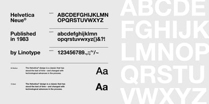
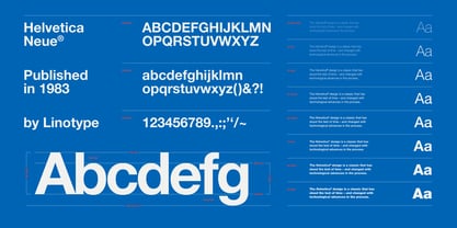
Neue Helvetica Pro 55 Roman
Neue Helvetica Pro 56 Italic
Neue Helvetica Pro 65 Medium
Neue Helvetica Pro 66 Medium Italic
Neue Helvetica Pro 75 Bold
Neue Helvetica Pro 76 Bold Italic
Neue Helvetica Pro 85 Heavy
Neue Helvetica Pro 86 Heavy Italic
Neue Helvetica Pro 95 Black
Neue Helvetica Pro 96 Black Italic
Neue Helvetica Pro 75 Bold Outline
Neue Helvetica Pro 27 Condensed Ultra Light
Neue Helvetica Pro 27 Condensed Ultra Light Oblique
Neue Helvetica Pro 37 Condensed Thin
Neue Helvetica Pro 37 Condensed Thin Oblique
Neue Helvetica Pro 47 Condensed Light
Neue Helvetica Pro 47 Condensed Light Oblique
Neue Helvetica Pro 57 Condensed
Neue Helvetica Pro 57 Condensed Oblique
Neue Helvetica Pro 67 Condensed Medium
Neue Helvetica Pro 67 Condensed Medium Oblique
Neue Helvetica Pro 77 Condensed Bold
Neue Helvetica Pro 77 Condensed Bold Oblique
Neue Helvetica Pro 87 Condensed Heavy
Neue Helvetica Pro 87 Condensed Heavy Oblique
Neue Helvetica Pro 97 Condensed Black
Neue Helvetica Pro 97 Condensed Black Oblique
Neue Helvetica Pro 107 Condensed Extra Black
Neue Helvetica Pro 107 Condensed Extra Black Oblique
Neue Helvetica Pro 23 Extended Ultra Light
Neue Helvetica Pro 23 Extended Ultra Light Oblique
Neue Helvetica Pro 33 Extended Thin
Neue Helvetica Pro 33 Extended Thin Oblique
Neue Helvetica Pro 43 Extended Light
Neue Helvetica Pro 43 Extended Light Oblique
Neue Helvetica Pro 53 Extended
Neue Helvetica Pro 53 Extended Oblique
Neue Helvetica Pro 63 Extended Medium
Neue Helvetica Pro 63 Extended Medium Oblique
Neue Helvetica Pro 73 Extended Bold
Neue Helvetica Pro 73 Extended Bold Oblique
Neue Helvetica Pro 83 Extended Heavy
Neue Helvetica Pro 83 Extended Heavy Oblique
Neue Helvetica Pro 93 Extended Black
Neue Helvetica Pro 93 Extended Black Oblique
Neue Helvetica Pro 29 Compressed Ultra Light
Neue Helvetica Pro 39 Compressed Thin
Neue Helvetica Pro 49 Compressed Light
Neue Helvetica Pro 59 Compressed Regular
Neue Helvetica Pro 69 Compressed Medium
Neue Helvetica Pro 79 Compressed Bold
Neue Helvetica Pro 89 Compressed Heavy
Neue Helvetica Pro 99 Compressed Black