Select this license type when you are developing an app for iOS, Android, or Windows Phone, and you will be embedding the font file in your mobile application's code.
PF Fusion Sans™ Pro
by Parachute
Individual Styles from $79.00
Complete family of 4 fonts: $275.00

PF Fusion Sans Pro Font Family was
designed by
Panos Vassiliou and
published by
Parachute. PF Fusion Sans Pro contains
4
styles and family package options.
More about this family
- Aa Glyphs
-
Best ValueFamily Packages
- Individual Styles
- Tech Specs
- Licensing
Per style:
$68.75
Pack of 4 styles:
$275.00
About PF Fusion Sans Pro Font Family
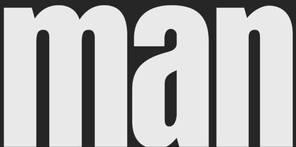
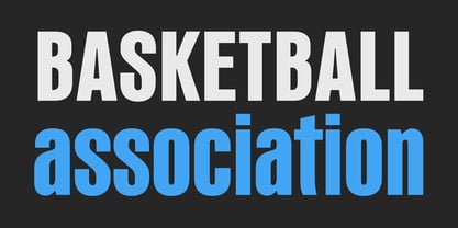
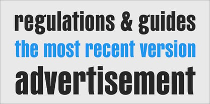
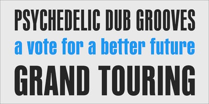
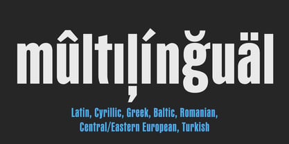
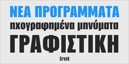
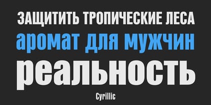
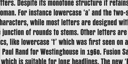
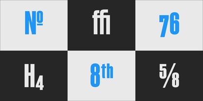
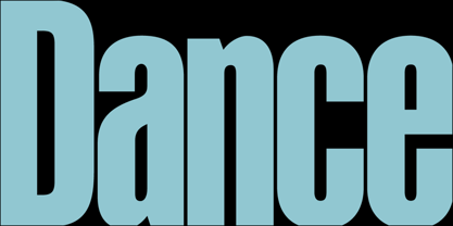
Fusion Sans is an amalgamation of traditional early nineteenth-century sans-serif letters. Despite its monotone structure it retains certain features common to roman. For instance lowercase ‘a’ and the two-storey ‘g’ are normal roman characters, while most letters are designed with a thinning of stroke at the junction of rounds to stems. Other letters are borrowed from earlier gothics, like lowercase ‘t’ which was first seen on a typeface that was developed by Paul Rand for Westinghouse in 1960. Fusion Sans is a tall family of 4 weights which is suitable for long headlines. The new ‘Pro’ version developed in 2006, provides support for all European languages including Greek and Cyrillic while it comes loaded with 19 special OpenType features.
Designers: Panos Vassiliou
Publisher: Parachute
Foundry: Parachute
Design Owner: Parachute
MyFonts debut: Jun 4, 2010
PF Fusion Sans™ Pro
is a trademark of Parachute and may be registered in certain jurisdictions.
About Parachute
Parachute is a digital type foundry and design agency, specialising in bespoke type design, corporate typefaces and lettering. We use the power of typography to transform living brands to global brands, enrich their identity and localise their language in emerging markets. Never content with the average, we manage to bridge the West with the East, the North with the South and combine tradition with innovation. We have collaborated with several leading organizations since 2001 and designed proprietary typefaces for some of the world’s most iconic brands and institutions such as Bank of America, Apple, European Commission, National Geographic, Ikea, Kraft Foods, UEFA, Samsung, Financial Times, Pernod Ricard, Ogilvy, Emirates.Our work has earned numerous accolades around the world with top honours from TDC, Red Dot, European Design Awards, Tokyo TDC, HiiiBrand, Granshan Awards, Communication Arts and many others.
Read more
Read less
- Choosing a selection results in a full page refresh.