Select this license type when you are developing an app for iOS, Android, or Windows Phone, and you will be embedding the font file in your mobile application's code.
Chez Moustache
by PintassilgoPrints
Individual Styles from $29.00

Chez Moustache Font Family was
designed by
Erica Jung,
Ricardo Marcin and
published by
PintassilgoPrints. Chez Moustache contains
1
styles.
More about this family
About Chez Moustache Font Family
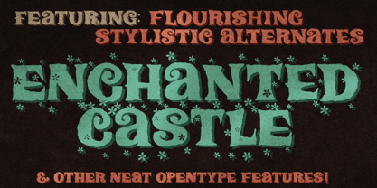
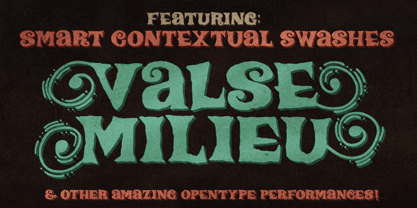
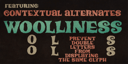
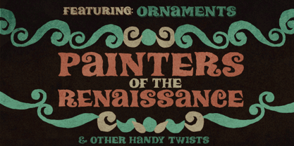
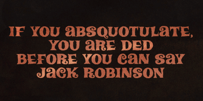
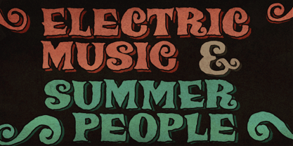
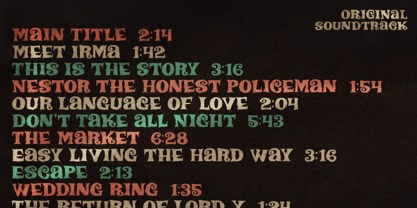
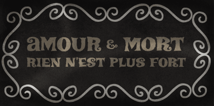
Based on Irma La Douce film opening titles, Chez Moustache is a very eye-catching display font loaded with cool special effects. It is a unicase typeface with 2 versions for each letter, each easily accessible through upper and lower case keys. To prevent double letters from displaying the same glyph, just type the alternate glyph, or use the neat OpenType feature to make things even easier: just turn on the contextual alternates in any OpenType aware program and it's all done before you can say Jack Robinson. Did you push the stylistic alternates button instead of the contextual one? Voilà, so you've got a pocketful of flowers! There's a complete set of sweet stylistic alternates to instantly flourish your way. And it's not over yet: check out the cool initial and terminal forms for that extra twist. Pick your choices with a glyphs palette or just turn on the OpenType swash feature. Now go ahead, there's a lot to do Chez Moustache. But that's another story...
Designers: Erica Jung, Ricardo Marcin
Publisher: PintassilgoPrints
Foundry: PintassilgoPrints
Design Owner: PintassilgoPrints
MyFonts debut: Mar 15, 2012
Chez Moustache
About PintassilgoPrints
Their first commercial font is from 2009. And it didn’t take long for PintassilgoPrints typefaces to be picked by creatives to speak for brands such as McDonald's, Starbucks, Cartoon Network, Jamie Oliver, Hasbro, Mattel, Gap, Taschen, Rovio and others. Check out examples of the foundry's fonts in use here. With a strong background in hand printing techniques, PintassilgoPrints has been developing a consistent and original library, with fonts ranking to our best-selling list and Rising Star issues. Their work was also featured in printed magazines and books such as Computer Arts, Page Magazine, Slanted, PicNic, Typolyrics, Typodarium, The Yearbook of Type. The foundry was interviewed for our Creative Characters newsletter as well as for the prestigious 8 Faces Magazine. PintassilgoPrints fonts are often packed with many alternative glyphs and a clever touch of OpenType programming. Their typefaces mostly reflect a vigorous handcrafted feel, seasoned with some 'je ne sais quoi' that decidedly works. Horst was their first Best Seller and Rising Star font, the same route taken by Monstro and Populaire. This ubiquitous one also made it to the Most Popular Fonts of 2011 list. Now established in Florianópolis, an island city in Brazil, the foundry is run by Ricardo Marcin and Erica Jung, who also share life, kids and a long time love of typography, graphic arts, music and sun. By the time of their interview for Creative Characters they were based in Vitória, curiously also an island. Definitely many more sunshiny fonts are yet to come from PintassilgoPrints. Stay tuned!The premium foundry page can be viewed Here.
Read more
Read less
- Choosing a selection results in a full page refresh.