Select this license type when you are developing an app for iOS, Android, or Windows Phone, and you will be embedding the font file in your mobile application's code.
Harfang™ Pro
by PSY/OPS
Individual Styles from $45.00
Complete family of 12 fonts: $139.00

Harfang Pro Font Family was
designed by
André Simard and
published by
PSY/OPS. Harfang Pro contains
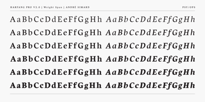
12
styles and family package options.
More about this family
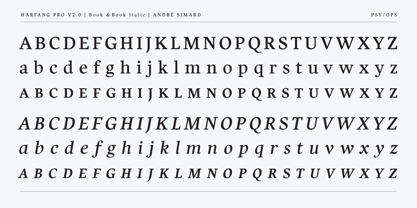
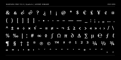
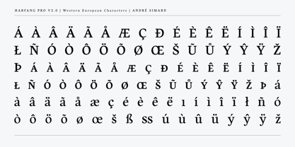
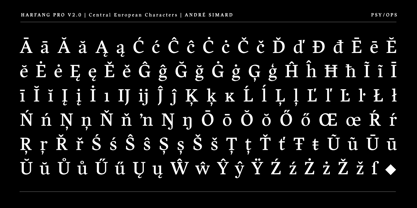
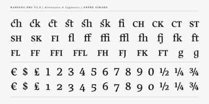
- Aa Glyphs
-
Best ValueFamily Packages
- Individual Styles
- Tech Specs
- Licensing
About Harfang Pro Font Family
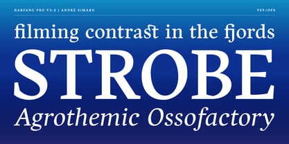
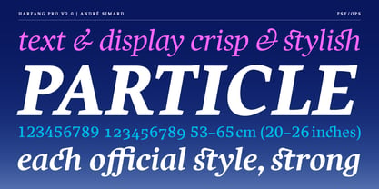
My goal for Harfang was to create a serif typeface that would be easy to read at text sizes, while having a strong personality at larger sizes. The initial design had a purely rounded style, but with each development pass I introduced some angularity. The final result is a typeface that is easy to read in long texts, advertising copy, annual reports and the like; but one that also provides a crisp and stylish appeal in more prominent display settings. I choose the name Harfang (Harfang des neiges — Snowy Owl or Great White Owl) because after my first typeface, Migration, I wanted something with a thematic relation. On a more personal level, Harfang is the official bird of Québec, a province with a long winter and a wonderful, white landscape, and the place I call home. —André Simard
Designers: André Simard
Publisher: PSY/OPS
Foundry: PSY/OPS
Original Foundry: unknown
Design Owner: PSY/OPS
MyFonts debut: Apr 23, 2010
Harfang™ Pro
is a trademark of Psy/Ops.
About PSY/OPS
PSY/OPS is a type design company based in San Francisco, California. It was founded by Rod Cavazos. This five-person studio specializes in custom typeface development and has completed commissions for dozens of top-tier clients since 1995.
Read more
Read less
- Choosing a selection results in a full page refresh.