Select this license type when you are developing an app for iOS, Android, or Windows Phone, and you will be embedding the font file in your mobile application's code.
Artefact®
by Shinntype
Individual Styles from $39.00
Complete family of 3 fonts: $69.00

Artefact Font Family was
designed by
Nick Shinn and
published by
Shinntype. Artefact contains
3
styles and family package options.
More about this family
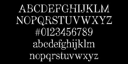
- Aa Glyphs
-
Best ValueFamily Packages
- Individual Styles
- Tech Specs
- Licensing
Per style:
$23.00
Pack of 3 styles:
$69.00
About Artefact Font Family
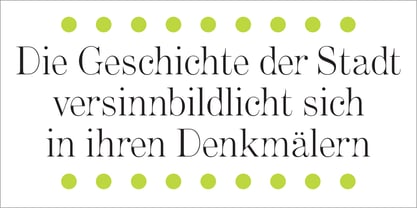
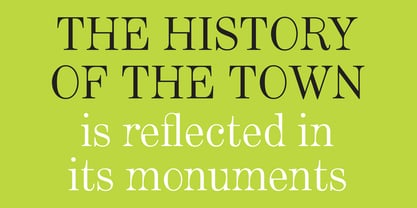
Rearranging the conventional disposition of thick and thin strokes in the Modern (Didone) class of typeface.
Designers: Nick Shinn
Publisher: Shinntype
Foundry: Shinntype
Design Owner: Shinntype
MyFonts debut: Apr 12, 2002
Artefact®
is a registered trademark of Shinn Type Foundry Inc., and Shinntype is a registered trademark of Shinn Type Foundry Inc.

About Shinntype
These are Nick Shinn’s designs, firmly rooted in the best of the European and North American typographic tradition as it continually evolves. They are solid in text, providing all the bells and whistles of expert typography, and smart in display, with an impeccable attention to detail. Building on his experience as an art director and graphic designer in the 1980s and 90s, and as a pioneer of digital media, Nick launched Shinntype—one of the first online type foundries—in 1998. Shinntype now presents a rich and eclectic catalogue of unique fonts, tailored to contemporary taste.
Read more
Read less
- Choosing a selection results in a full page refresh.