Select this license type when you are developing an app for iOS, Android, or Windows Phone, and you will be embedding the font file in your mobile application's code.
Garcon Grotesque
by Thomas Jockin
Individual Styles from $50.00
Complete family of 5 fonts: $225.00

Garcon Grotesque Font Family was
designed by
published by
Thomas Jockin. Garcon Grotesque contains
5
styles and family package options.
More about this family
- Aa Glyphs
-
Best ValueFamily Packages
- Individual Styles
- Tech Specs
- Licensing
Per style:
$45.00
Pack of 5 styles:
$225.00
About Garcon Grotesque Font Family
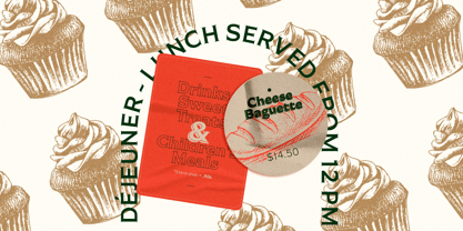
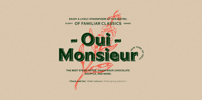
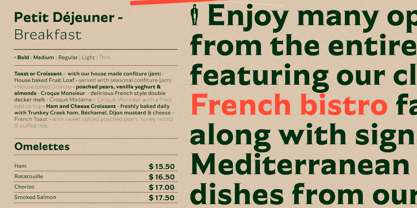
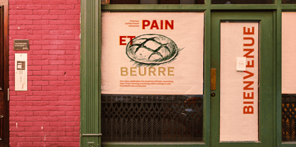
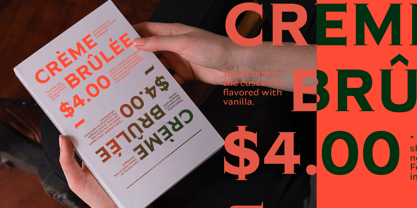
From pastiche to sophistication, Garçon Grotesque improves on a classic for today's designer. Designed in a multitude of weights, extended latin character set, small capitals and a working lowercase, Garçon is built for any situation that calls for sophistication, elegance and culture. Built in five weights, Garçon Grotesque allows for great flexibility. Use the Bold weight for beefy headlines. Use the the medium and regular weights for subheads and decks. Use the Light and Thin weights for a softer, more delicate tone. All weights have the same size spurs, so you can mix and match! Right out of the box, Garçon Grotesque offers full language support to most eastern european speaking territories. Most foundries release these accent characters as a "pro" release at an additional fee. Just because you speak Turkish or Croatian, shouldn't mean you have to pay more than a designer who speaks English. Please see the Specimen PDF for more information about languages supported. Accessible as an OpenType Feature, Garçon Grotesque offers alternate forms of the uppercase "J", and the lowercase "a" and "g". Use Stylistic Set 01 for the alternate form capital J. Use Stylistic Set 02 for the alternate form of the lowercase a. Use Stylistic Set 03 for the alternate form of the lowercase g. Also accessible as an OpenType Feature, Garçon Grotesque offers tabular figures in all five weights. Perfect for menus, tabular figures allow for number listings to align easily and without shifting if a different font weight is selected for emphasis.
Designers:
Publisher: Thomas Jockin
Foundry: Thomas Jockin
Design Owner: Thomas Jockin
MyFonts debut: May 14, 2012
Garcon Grotesque
About Thomas Jockin
“I love the tough design briefs,” Thomas Jockin says. “A retail typeface is the chance to tackle bigger, and more complex, design problems.” Located in Williamsburg, Brooklyn, Thomas is a member at a co-working space called The Bakery. “I love the mix of different creative disciplines working in the same space,” he said in his #fontface feature. “I’m easily the messiest of my studio mates. I tell myself that my charming personality makes up for the gnarly feng-shui.” Thomas first became interested in type design when he met Joshua Darden, the chief designer and founder of the Brooklyn-based foundry Darden Studio. He spent three years as Joshua’s apprentice before moving on to study at the inaugural Type@Cooper program under Jesse Regan. He started his own foundry in 2011 with the release of his debut typeface, Garçon Grotesque. Since then, he’s gone on to release two more families: Ductus, a five-weight face whose style is as ancient as it is contemporary; and more recently, Azote, a multiline type family inspired by the 1968 Mexican Olympics that adds lines for weight. “One of my great joys in 2015 is the type design meet-up I organize called TypeThursday,” Thomas said. “It’s a monthly type critique meets social mixer meets a great time. With so much type talent and interest in New York, a meeting place for us all to catch up, share our work and relate outside Twitter made sense to me.”
Read more
Read less
- Choosing a selection results in a full page refresh.