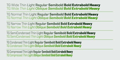
Tablet Gothic Thin
Tablet Gothic Thin Oblique
Tablet Gothic Light
Tablet Gothic Light Oblique
Tablet Gothic Regular
Tablet Gothic Oblique
Tablet Gothic SemiBold
Tablet Gothic SemiBold Oblique
Tablet Gothic Bold
Tablet Gothic Bold Oblique
Tablet Gothic ExtraBold
Tablet Gothic ExtraBold Oblique
Tablet Gothic Heavy
Tablet Gothic Heavy Oblique
Tablet Gothic Wide Thin
Tablet Gothic Wide Thin Oblique
Tablet Gothic Wide Light
Tablet Gothic Wide Light Oblique
Tablet Gothic Wide Regular
Tablet Gothic Wide Oblique
Tablet Gothic Wide SemiBold
Tablet Gothic Wide SemiBold Oblique
Tablet Gothic Wide Bold
Tablet Gothic Wide Bold Oblique
Tablet Gothic Wide ExtraBold
Tablet Gothic Wide ExtraBold Oblique
Tablet Gothic Wide Heavy
Tablet Gothic Wide Heavy Oblique
Tablet Gothic Compressed Thin
Tablet Gothic Compressed Thin Oblique
Tablet Gothic Compressed Light
Tablet Gothic Compressed Light Oblique
Tablet Gothic Compressed Regular
Tablet Gothic Compressed Oblique
Tablet Gothic Compressed SemiBold
Tablet Gothic Compressed SemiBold Oblique
Tablet Gothic Compressed Bold
Tablet Gothic Compressed Bold Oblique
Tablet Gothic Compressed ExtraBold
Tablet Gothic Compressed ExtraBold Oblique
Tablet Gothic Compressed Heavy
Tablet Gothic Compressed Heavy Oblique
Tablet Gothic Condensed Thin
Tablet Gothic Condensed Thin Oblique
Tablet Gothic Condensed Light
Tablet Gothic Condensed Light Oblique
Tablet Gothic Condensed Regular
Tablet Gothic Condensed Oblique
Tablet Gothic Condensed SemiBold
Tablet Gothic Condensed SemiBold Oblique
Tablet Gothic Condensed Bold
Tablet Gothic Condensed Bold Oblique
Tablet Gothic Condensed ExtraBold
Tablet Gothic Condensed ExtraBold Oblique
Tablet Gothic Condensed Heavy
Tablet Gothic Condensed Heavy Oblique
Tablet Gothic SemiCondensed Thin
Tablet Gothic SemiCondensed Thin Oblique
Tablet Gothic SemiCondensed Light
Tablet Gothic SemiCondensed Light Oblique
Tablet Gothic SemiCondensed Regular
Tablet Gothic SemiCondensed Oblique
Tablet Gothic SemiCondensed SemiBold
Tablet Gothic SemiCondensed SemiBold Oblique
Tablet Gothic SemiCondensed Bold Oblique
Tablet Gothic SemiCondensed Bold
Tablet Gothic SemiCondensed ExtraBold
Tablet Gothic SemiCondensed ExtraBold Oblique
Tablet Gothic SemiCondensed Heavy
Tablet Gothic SemiCondensed Heavy Oblique
Tablet Gothic Narrow Thin
Tablet Gothic Narrow Thin Oblique
Tablet Gothic Narrow Light
Tablet Gothic Narrow Light Oblique
Tablet Gothic Narrow Regular
Tablet Gothic Narrow Oblique
Tablet Gothic Narrow SemiBold
Tablet Gothic Narrow SemiBold Oblique
Tablet Gothic Narrow Bold
Tablet Gothic Narrow Bold Oblique
Tablet Gothic Narrow ExtraBold
Tablet Gothic Narrow ExtraBold Oblique
Tablet Gothic Narrow Heavy
Tablet Gothic Narrow Heavy Oblique