Select this license type when you are developing an app for iOS, Android, or Windows Phone, and you will be embedding the font file in your mobile application's code.
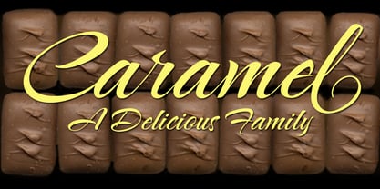
Caramel Family ROB
by TypeSETit
Individual Styles from $19.95
Complete family of 3 fonts: $49.95

Caramel Family ROB Font Family was
designed by
Rob Leuschke and
published by
TypeSETit. Caramel Family ROB contains
3
styles and family package options.
More about this family
- Aa Glyphs
-
Best ValueFamily Packages
- Individual Styles
- Tech Specs
- Licensing
Per style:
$16.65
Pack of 3 styles:
$49.95
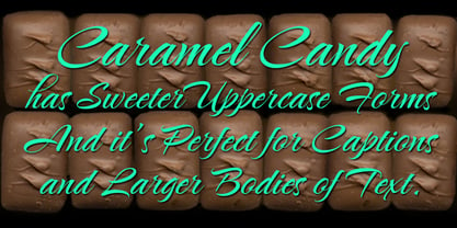
About Caramel Family ROB Font Family
Fun, hand-lettered script.
Designers: Rob Leuschke
Publisher: TypeSETit
Foundry: TypeSETit
Design Owner: TypeSETit
MyFonts debut: May 1, 2009
Caramel Family ROB
About TypeSETit
“I think it’s important as an artist to challenge myself and work outside of what’s comfortable,” TypeSETit’s founder, Robert Leuschke, said in his Creative Characters interview. Based just outside of St. Louis in the heart of the United States, Rob began his career working alongside some of the best lettering artists in the industry at Hallmark Cards. “I began working in the Lettering Department in July of 1983, and that’s when I really began to learn how to do lettering,” he says. “Working at Hallmark Cards was like going to graduate school and getting paid for it. It was fantastic.” He began working as a freelance graphic designer in the late 1980’s and realized that he could increase the production of his work by creating customized fonts of his hand lettering. He has created fonts ever since. After designing a few fonts for larger foundries like ITC and Bitstream, he began offering his designs on MyFonts in the summer of 2004. Since then, he’s seen great success with typefaces such as Corinthia, an elegant script that was featured on our Top Ten Fonts of 2008 list, and Style Script which was one of our Most Popular Fonts of 2013. Where does Rob draw inspiration for his noteworthy designs? “I try to look for things that are not what I would typically do,” he says, “then give them my own adaptation. If something catches my eye, I make a note or take a picture with my cellphone. That’s how I came up with Arizonia. I saw some lettering painted on a truck and took a photo.” “Sign painters have such a gift for beautiful letterforms. As for other designs, since I am proficient at much but master at nothing, I tend to combine styles. Take for example, Lovers Quarrel or Passions Conflict. They both have a calligraphic feel, but I intentionally broke rules and added swashes and swirls, especially with the uppercase forms and then gave them a more contemporary script look.” Prior to 2004, embellished forms were a rarity in the font world. “I think my introduction of more hand lettered looking fonts inspired other artists to think outside of traditional typeface design. For example, I was one of the first designers to offer words and phrases in glyphs with my Holiday Font. I only recently discovered that a term for that is ‘word art.’ I’d like to think that I have been a trend-setter in that respect.”
Read more
Read less
- Choosing a selection results in a full page refresh.