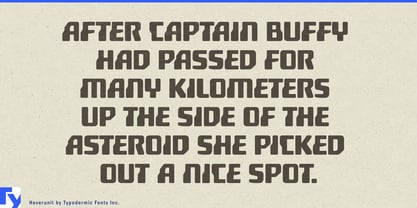
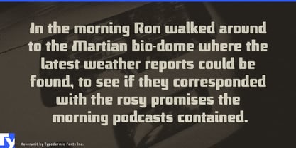
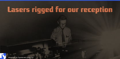
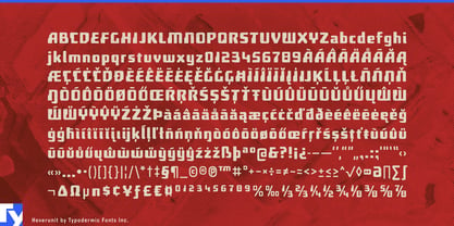
Hoverunit takes the strange construction logic of 1960s MICR lettering and turns it into something sturdier, broader, and easier for humans to read. Squared forms, softened corners, and unusual stroke interruptions retain the sense that the alphabet was designed according to machine requirements, but Hoverunit is not trying to reproduce a cheque-reading system. The MICR influence supplies the engineering DNA; the rest is built for display typography.
That combination gives Hoverunit a natural place on products designed to survive rough treatment. Rugged watches, field instruments, portable electronics, flashlights, power banks, protective cases, outdoor equipment, and worksite gear all need visible typography for model names, series numbers, modes, capacities, and specifications. Hoverunit gives those details an engineered character without making them difficult to decipher. It looks less like software than something moulded into the housing.
Tools and workshop products offer the same opportunity. Power-tool cases, batteries, welding equipment, replacement parts, filters, work lights, fasteners, and automotive components often build their visual hierarchy around product families, model designations, sizes, voltages, capacities, or duty ratings. Hoverunit makes that information feel like part of the equipment rather than decoration applied afterward.
Its ruggedness does not depend on distress, military stencils, or simulated grime. The effect comes from construction. The letters are compact, substantial, and deliberately odd in places, with enough structural excess to suggest they could take a knock. That makes Hoverunit equally plausible on clean contemporary products where durability is part of the appeal.
Off-road and field equipment open another useful territory. Utility vehicles, recovery gear, expedition cases, emergency radios, surveying instruments, environmental monitoring equipment, and portable scientific hardware all rely on short identification systems. Equipment numbers, sensor labels, kit names, vehicle markings, and section headings can adopt Hoverunit’s machine-oriented appearance while remaining comfortably readable at a glance.
The MICR connection can also be used more literally in projects about banking, automated data processing, financial systems, or mid-century technology. Historical exhibits, documentary graphics, fictional payment systems, and archival displays can draw on the source without pretending Hoverunit itself is an authentic machine-readable MICR face.
Hoverunit works best as identification typography: product names, model numbers, package callouts, equipment categories, decals, headings, and short technical phrases. It has the encoded look of lettering intended for machines, but the rugged readability of lettering intended to keep working around them.