Select this license type when you are developing an app for iOS, Android, or Windows Phone, and you will be embedding the font file in your mobile application's code.
Wyvern™
by Typodermic
Individual Styles from $13.95
Complete family of 17 fonts: $21.95


Wyvern Font Family was
designed by
Ray Larabie and
published by
Typodermic. Wyvern contains
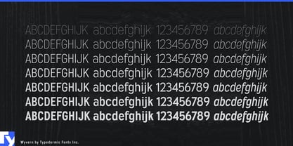
17
styles and family package options.
More about this family
- Aa Glyphs
-
Best ValueFamily Packages
- Individual Styles
- Tech Specs
- Licensing
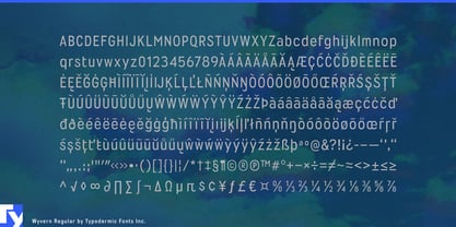
About Wyvern Font Family
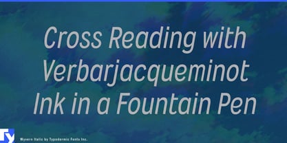
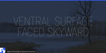
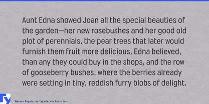
Introducing Wyvern—the sans-serif typeface that exudes professionalism and precision. With its high x-height and short descenders, Wyvern is a true testament to the vintage typewriters and daisy wheel printers that inspired its creation. Its sleek and compact design boasts clean edges that give it an open and vibrant appearance, perfect for businesses looking to make a brave statement.
But it’s not just its appearance that sets Wyvern apart—its italics are a testament to its strength. With angled stems and altered stem widths, Wyvern maintains a dynamic and natural appearance without the use of cursive forms. This makes Wyvern ideal for businesses that want to convey a sense of innovation and forward-thinking.
Wyvern comes in seven weights and italics, providing a range of options for businesses looking to make their mark. Whether you’re creating an audacious new brand identity or refining your existing design, Wyvern is the perfect choice for designers that want to make an impact. So why wait? Experience the power of Wyvern today and take your design to the next level.
Most Latin-based European writing systems are supported, including the following languages. Afaan Oromo, Afar, Afrikaans, Albanian, Alsatian, Aromanian, Aymara, Bashkir (Latin), Basque, Belarusian (Latin), Bemba, Bikol, Bosnian, Breton, Cape Verdean, Creole, Catalan, Cebuano, Chamorro, Chavacano, Chichewa, Crimean Tatar (Latin), Croatian, Czech, Danish, Dawan, Dholuo, Dutch, English, Estonian, Faroese, Fijian, Filipino, Finnish, French, Frisian, Friulian, Gagauz (Latin), Galician, Ganda, Genoese, German, Greenlandic, Guadeloupean Creole, Haitian Creole, Hawaiian, Hiligaynon, Hungarian, Icelandic, Ilocano, Indonesian, Irish, Italian, Jamaican, Kaqchikel, Karakalpak (Latin), Kashubian, Kikongo, Kinyarwanda, Kirundi, Kurdish (Latin), Latvian, Lithuanian, Lombard, Low Saxon, Luxembourgish, Maasai, Makhuwa, Malay, Maltese, Māori, Moldovan, Montenegrin, Ndebele, Neapolitan, Norwegian, Novial, Occitan, Ossetian (Latin), Papiamento, Piedmontese, Polish, Portuguese, Quechua, Rarotongan, Romanian, Romansh, Sami, Sango, Saramaccan, Sardinian, Scottish Gaelic, Serbian (Latin), Shona, Sicilian, Silesian, Slovak, Slovenian, Somali, Sorbian, Sotho, Spanish, Swahili, Swazi, Swedish, Tagalog, Tahitian, Tetum, Tongan, Tshiluba, Tsonga, Tswana, Tumbuka, Turkish, Turkmen (Latin), Tuvaluan, Uzbek (Latin), Venetian, Vepsian, Võro, Walloon, Waray-Waray, Wayuu, Welsh, Wolof, Xhosa, Yapese, Zapotec Zulu and Zuni.
Designers: Ray Larabie
Publisher: Typodermic
Foundry: Typodermic
Original Foundry: unknown
Design Owner: Typodermic
MyFonts debut: Oct 17, 2001
Wyvern™
is a trademark of Typodermic.
About Typodermic
Welcome to Typodermic Fonts, a spirited type foundry rooted in Nagoya, Japan, started by the Canadian typeface designer, Raymond Larabie in 2001. Our library brims with 500+ diverse typefaces to fuel creativity in graphic design, advertising, web, and app development. As digital type pioneers, we adopted web fonts and app licensing early, consistently pushing the design envelope. With Canadian heart and Japanese precision, we're your global partners in extraordinary typography. Explore Typodermic Fonts—where creativity meets character.
Read more
Read less
- Choosing a selection results in a full page refresh.