Select this license type when you are developing an app for iOS, Android, or Windows Phone, and you will be embedding the font file in your mobile application's code.
False Idol
by Barnbrook Fonts
Individual Styles from $30.00
Complete family of 2 fonts: $48.00


False Idol Font Family was
designed by
Jonathan Barnbrook and
published by
Barnbrook Fonts. False Idol contains
2
styles and family package options.
More about this family
- Aa Glyphs
-
Best ValueFamily Packages
- Individual Styles
- Tech Specs
- Licensing
Per style:
$24.00
Pack of 2 styles:
$48.00
About False Idol Font Family
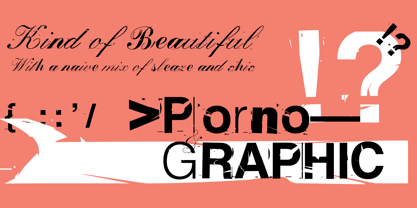
False Idol is based on bad rub-down lettering from 1970s pornographic magazines and home-made religious leaflets. The letterforms were intended to mimic a feeling of cheap glamour but just became seedy. Somehow an alluring beauty emerges from this mix of sleaze and chic...
Designers: Jonathan Barnbrook
Publisher: Barnbrook Fonts
Foundry: Barnbrook Fonts
Design Owner: Barnbrook Fonts
MyFonts debut: Aug 18, 2003
False Idol
About Barnbrook Fonts
The font foundry of designers Barnbrook and Jonathan Barnbrook, formerly known as Virusfonts. Creators of Emigre Fonts Exocet, Mason and Priori. Designers of David Bowie Record covers. Iconoclastic collaborators with Damien Hirst and Adbusters. Branders for major museums, locations and art biennales. The studio is based in London and continues to work on a wide variety of cultural and musical projects and museum exhibitions.
Read more
Read less
- Choosing a selection results in a full page refresh.