Select this license type when you are developing an app for iOS, Android, or Windows Phone, and you will be embedding the font file in your mobile application's code.
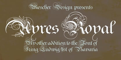
Ayres Royal
by Wiescher Design
Licenses from $49.50
Complete family of 2 fonts: $49.50
Ayres Royal Font Family was
designed by
Gert Wiescher and
published by
Wiescher Design. Ayres Royal contains
2
styles and family package options.
More about this family
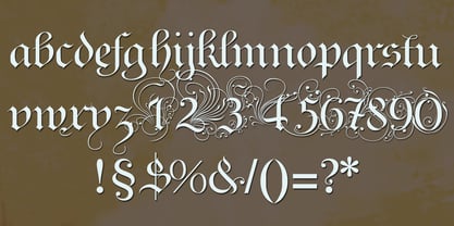
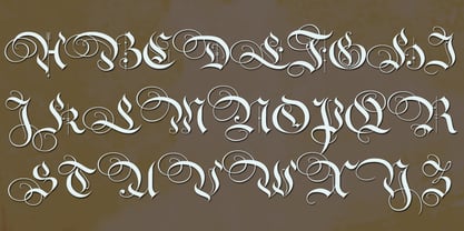
- Aa Glyphs
-
Best ValueFamily Packages
- Individual Styles
- Tech Specs
- Licensing
-
Ayres Royal
-
Ayres Royal Plus
Per style:
$24.75
Pack of 2 styles:
$49.50
About Ayres Royal Font Family
I designed Ayres Royal to honour London’s famous calligrapher John Ayres (about 1700). He designed calligraphy examples called The Accomplished Clerk, that were meant to be for the office clerk. I doubt if there were many clerks in those times that were able to write such beautiful letters. In order for the font to be of any use, I adjusted my Royal Bavarian Script to go together with the initials of John Ayres. The two fonts have to be used together, that’s why I am not selling them as singles. It would be bad style to use the font with the initials only. In some languages, such as German, there are too many capital words and the many heavily-decorated initials would make longer texts very hard to read. Your historical designer Gert Wiescher
Designers: Gert Wiescher
Publisher: Wiescher Design
Foundry: Wiescher Design
Design Owner: Wiescher Design
MyFonts debut: Jun 7, 2005
Ayres Royal
About Wiescher Design
The Munich studio of graphic designer and type designer Gert Wiescher. Check his Person page for more info!
Read more
Read less
- Choosing a selection results in a full page refresh.