Select this license type when you are developing an app for iOS, Android, or Windows Phone, and you will be embedding the font file in your mobile application's code.
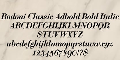
Bodoni Classic Ad
by Wiescher Design
Individual Styles from $55.00
Complete family of 4 fonts: $199.00

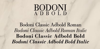
Bodoni Classic Ad Font Family was
designed by
Gert Wiescher and
published by
Wiescher Design. Bodoni Classic Ad contains
4
styles and family package options.
More about this family
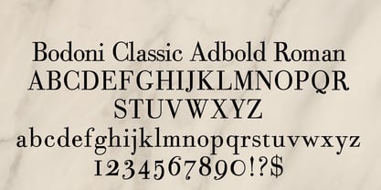
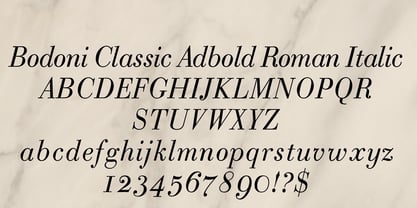
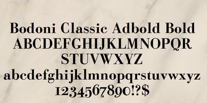
- Aa Glyphs
-
Best ValueFamily Packages
- Individual Styles
- Tech Specs
- Licensing
Per style:
$49.75
Pack of 4 styles:
$199.00
About Bodoni Classic Ad Font Family
I became interested in designing Bodoni Classic because of a lazy graphic designer at Jacques Damase publishing house. He had to change a single letter on a bookcover about J. B. BODONI. The French call him Jean Baptiste instead of Giambattista! And that unknown graphic designer just took any old “J” from some newly cut Bodoni. All the new Bodoni cuts have square serifs, whereas the originals had rounded serifs and slightly concave feet. The single letter “J” with the squared off serif was for me like a road sign to start redesigning the entire Bodoni family. That’s exactly what I started in 1993 and a dozen years later I am finished. Okay, I am still adding new Bodoni Classics, but those are my personal additions. Yours very retro, Gert Wiescher
Designers: Gert Wiescher
Publisher: Wiescher Design
Foundry: Wiescher Design
Design Owner: Wiescher Design
MyFonts debut: Jan 4, 2005
Bodoni Classic Ad
About Wiescher Design
The Munich studio of graphic designer and type designer Gert Wiescher. Check his Person page for more info!
Read more
Read less
- Choosing a selection results in a full page refresh.