Neue Kabel
Neue Kabel – contemporary redesign of a classic
Originally designed by Rudolf Koch and published in 1927, Kabel® is an impressive combination of Art Deco elements and structured, geometric forms. Now, Marc Schütz has updated the classic as Neue Kabel®, an expanded version adapted to today’s typographic requirements. Neue Kabel is a great text font, but also offers plenty of originality for perfectly designed logos, thanks to its numerous alternative historical characters.
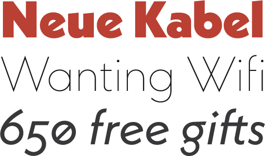
Commissioned by the font foundry Gebrüder Klingspor, “Leichte Kabel”, the first member of the Kabel family, appeared in 1927. The family grew to include ten styles over time. The lively, Art Deco-inspired elements set Kabel apart from other geometric serif fonts of the Bauhaus era. The font remains popular among designers to this day. The individual styles, however, feature designs that differ slightly, which makes them less homogeneous than many of today’s font families.
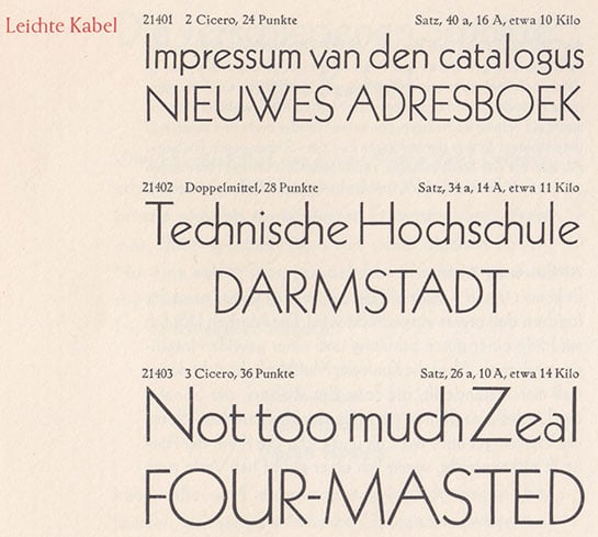
Leichte Kabel font samples from a historic Gebrüder Klingspor font sample book
In order to create a Kabel that meets modern-day typographic requirements, Schütz based his redesign on original prints and designs, which he studied in the archives of the Klingspor Museum. He removed the elements that do not work in all styles, but maintained the lively and elegant character of the original Kabel: characters derived from the geometric circle and, in some cases, with unusually shaped and slightly beveled line ends.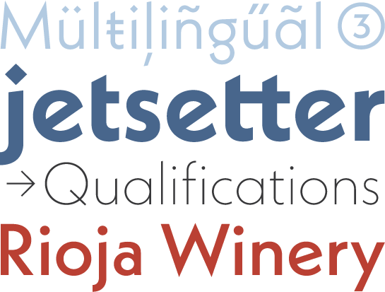
Moreover, round points in Schütz’s design provide for additional liveliness and warmth.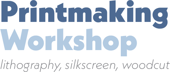
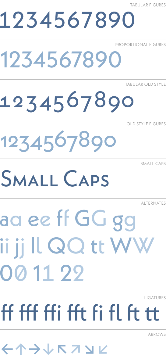
Numerous, historical alternative characters are available to help you customize your design. You can use the reduced “G” or “Q”, for example, the lower-case “f" with a one-sided crossbar, the “w” with crossed stems or the diamond-shaped points. A closed “a” or a conventional, single-story “g” are also available.
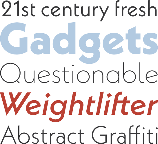 Neue Kabel has nine finely graded weights, from Thin to Black, each with its own italic. The font offers the perfect options, including the various number sets, small caps as well as numerous ligatures.
The fresh update of Neue Kabel brings the elegance and playfulness of Koch’s designs into the 21st century. The contemporary options and legibility open up a world of countless potential applications, including longer text, headlines or unique logos.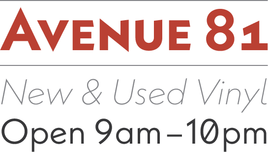

Leichte Kabel font samples from a historic Gebrüder Klingspor font sample book
In order to create a Kabel that meets modern-day typographic requirements, Schütz based his redesign on original prints and designs, which he studied in the archives of the Klingspor Museum. He removed the elements that do not work in all styles, but maintained the lively and elegant character of the original Kabel: characters derived from the geometric circle and, in some cases, with unusually shaped and slightly beveled line ends.

Moreover, round points in Schütz’s design provide for additional liveliness and warmth.

Numerous, historical alternative characters are available to help you customize your design. You can use the reduced “G” or “Q”, for example, the lower-case “f" with a one-sided crossbar, the “w” with crossed stems or the diamond-shaped points. A closed “a” or a conventional, single-story “g” are also available.
 Neue Kabel has nine finely graded weights, from Thin to Black, each with its own italic. The font offers the perfect options, including the various number sets, small caps as well as numerous ligatures.

The fresh update of Neue Kabel brings the elegance and playfulness of Koch’s designs into the 21st century. The contemporary options and legibility open up a world of countless potential applications, including longer text, headlines or unique logos.

Here you can find an interview with Marc Schütz on Neue Kabel