
Each year in January, newsletters follow up in quick succession here at MyFonts. Last week we presented our list of the Most Popular Fonts released in 2013; today it’s back to the future with our monthly Rising Stars. The mission of the newsletter is simple: we present four of the most successful recent typeface families in a variety of genres, plus three families designed for use in long-form texts — hoping to give you some ideas for adding a new color or two to your typographic palette. Enjoy!
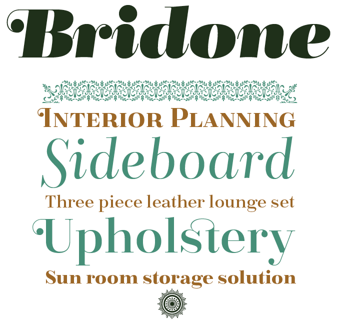
Bridone from Catalonia’s Tipo Pèpel foundry is a splendid new typeface in that style that is often labelled as “classicist” or “Didone”. Designer Josep Patau Bellart gives a more detailed description of its recipe on the font’s family page. Mixing the robustness of British slab serifs from the Victorian period (such as the spectacular display types by Vincent Figgins) with the marked high contrasts of Bodoni or Didot, Patau created a complete menu of tasty varieties for a wide range of uses and sizes — from elegant, large headlines to long-form text settings. Well-drawn and inventive, Bridone strikes a very nice balance between the elegance of Didones and the purposefulness of industrial Britain. Bridone is 70% off until January 25, 2014.
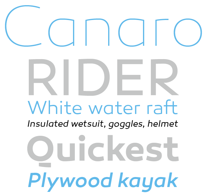
Canaro is the latest in Rene Bieder’s impressive series of successful new font families. Originally conceived as an exploration of geometric type designs of the early twentieth century, Canaro developed into something much more contemporary. Doing away with the spurs on lowercase letters such as a, d, g, m and n, Canaro is minimalist and clean without being ostentatious. In addition, the open shapes in combination with a tall x-height make sure that Canaro remains legible in small text sizes. The family comes in nine weights plus matching italics, with typographic features such as alternative lettershapes, ligatures, oldstyle numbers, arrows, fractions, special characters and more.
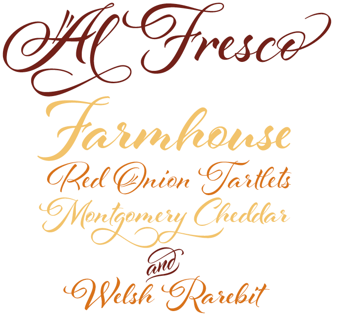
Not only was Al Fresco by Laura Worthington one of the most successful script fonts of the past couple of months, it is also one of the most sophisticated recent releases in its genre. Breezy and expressive, it is tailor-made for branding, packaging and titling work that calls for youthful flair, exuberance and unconventional beauty. Al Fresco is made even more versatile when Titling is activated in OpenType-savvy applications, offering swash forms, contextual alternates, and ornaments. Al Fresco, wrote Worthington, “was born in my imagination as an emblem of dining outside at twilight under twinkling lights, laughing warmly with friends, sipping signature cocktails and eating tapas — each bite dripping with intense flavor.” After the complexity and craziness of Charcuterie, Al Fresco is a return to basics: pure script forms, confidently drawn with felt brush pens.
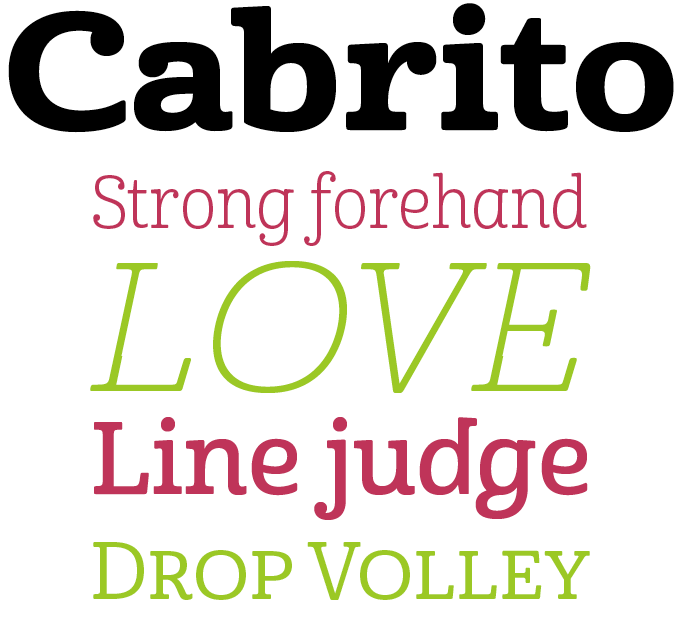
Designer Jeremy Dooley is a new father, and he plans to introduce his baby son to the wonderful world of fonts by way of his own book, The Clothes Letters Wear — a project he hopes to fund via Kickstarter (hurry if you want to contribute!). As an added bonus, the new children’s book has a custom designed font. “I am always looking for an excuse to design a new font,” say Dooley, “and this book created the perfect alibi.” Incorporating recent research on legibility for children, Cabrito is a pleasantly rounded typeface that includes not-so-strictly geometric, handwriting-inspired forms for b, d, p, and q. Cabrito’s slender weights are simple and fun; the bolder weights add typographic color and variety. The family comes with a nice bundle of extras (alternates, swashes, varieties with ball terminals, and special titling caps) that can be accessed in any OpenType-enabled software. Use Cabrito to convey warmth and friendliness in print and on the screen. The family is 77% off until February 3, 2014.
Text families of the month
Text typefaces for demanding editorial work need to possess special qualities: excellent readability, a generous range of weights with italics and small caps for all of them, multiple figure sets (lining, oldstyle, table) and ample language coverage. In this section of the newsletter you’ll find recent releases that meet these standards.
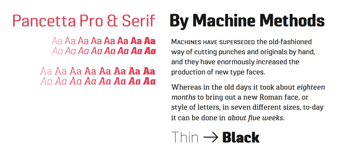
The key word in Mint Type’s description of their Pancetta Pro family is “pillow-shaped” — a cuddly way of referring to the curved horizontals and terminals that characterize the face. Their purpose, says designer Andriy Konstantynov, is to enliven the straight horizontal strokes that are so frequent in Cyrillic, the script used for the major languages in his native Ukraine. Pairing the sans-serif Pancetta Pro with Pancetta Serif Pro will result in a versatile type system with a strong personality. Two styles are free, and Pancetta Serif Pro is 80% off until January 31, 2014.
News Round-Up
In this section we pick out interesting news snippets from MyFonts’ own kitchen and from the greater world of fonts, lettering and typography.
TypeCon goes to Washington
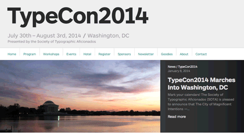 As many of you know, TypeCon is the friendly get-together of type geeks organized yearly by North America’s Society of Typographic Aficionados (SoTA). It has just been announced that SoTA has selected Washington, DC as host city for TypeCon 2014, which will take place from July 30 to August 3. Those eager to share the stage in the nation’s capital with what will undoubtedly be a sublime cast of speakers, or are otherwise interested in contributing, are encouraged to stay tuned and keep an eye on the TypeCon site and Twitter for updates.
Follow the Letterform Archive
 Among the remarkable contributions to the 2013 edition of TypeCon was a lecture on the maverick type designer, writer and artist W.A. Dwiggins by Rob Saunders, a San Francisco-based collector, designer, teacher and consultant. Many of the items from Saunders’ astounding collection of graphic design originals are viewable in glorious detail on his Letterform Archive website. Recently, the Archive made a stir in the typographic world by organizing a daunting quiz: design lovers and specialists were challenged to recognize close-ups of items from the Archive posted on Facebook and Twitter. The Archive also published a beautifully printed, limited-edition 2014 calendar featuring splendid reproductions photographed by specialist E.M. Ginger.
Webfonts at MyFonts

All of the top four Rising Stars fonts are available for licensing as webfonts. Visit Webfonts.info for HTML and CSS versions of this month’s Stars, plus lots of articles, resources and a showcase of web typography in the real world.


ColophonThe Rising Stars nameplate is set in Auto 3 and Proxima Nova Soft. |
Subscription info
Had enough? Unsubscribe immediately via this link: To change your email address or email preferences, log into your MyFonts account and edit your Account Settings. Want to get future MyFonts newsletters sent to your inbox? Subscribe at: |
Comments?We’d love to hear from you! Please send any questions or comments about this newsletter to [email protected] |