About Hermanz Titling Font Family
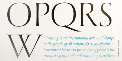
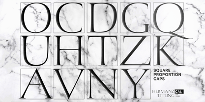
Hermanz™ Titling is inspired by the most majestic caps that Hermann Zapf ever drew. They are inscriptional caps, square caps, or “capitalis monumentalis”. These caps are some of the most beautiful letters made by one of the greatest talents of our time; so beautiful they deserve to be seen and appreciated by everyone.
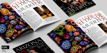
If you do any work for churches, wedding, funeral, anniversary, or other ceremonies, for the fine arts, exclusive clubs, or higher education—you will love how these letters make your brochures, pamphlets and announcements look.
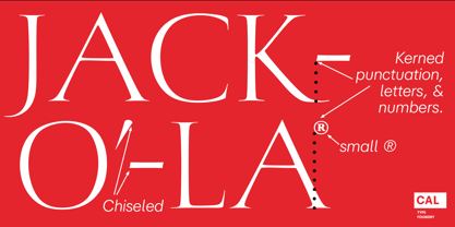
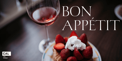
Hermanz Titling works for anything labeled "fine": fine dining, fine music, fine art (pamphlets, books, posters, cookbooks). It also fits well for religious topics: posters, events, websites, hymnals, for biblical; and ceremonies, religious or otherwise.
Emotions It Can Communicate:
• Importance
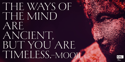
• Timelessness
• Special Event
• Tradition
• Reverence
• Artistry
• Beauty
Released June 2021 on the Memorial of Hermann Zapf, as part of the California Type Foundry Memorial Series: Honoring the life and work of the great font designers.
FONT STORY
The Majestic Caps
When I was on one of my visits to rare books rooms I found some large caps of Hermann Zapf, and I knew that I had to make a font inspired by these.
I was surprised that no one had ever made them into a font. They were some of the most beautiful caps I had ever seen.
These caps were surprisingly difficult to make. I thought it would take me a week or two; to get the detail and spirit right took significantly longer– but it was well worth the effort!
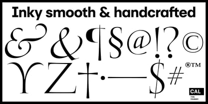
When you print Hermanz Titling on a page, you will see what I mean. Even when printed digitally, it’s the closest thing to letterpress. You might even have some people thing it was printed by a traditional method with ink! (Note: Unless printed at very large sizes, this font is not recommended for actual letterpress, because the serifs are too thin.)
If you do any work for churches, wedding, funeral, anniversary, or other ceremonies, for the fine arts, exclusive clubs, or higher education—you will love how these letters make your brochures, pamphlets and announcements look.
Enjoy this breathtaking font, and may it help inspire people with your messages! –Dave Lawrence & the California Type Foundry
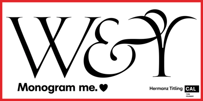
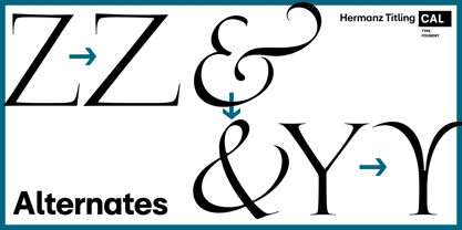
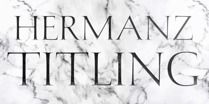
Hermanz Titling
About California Type Foundry
Fonts inspired by times past and the great font designers (Origin & Memorial Series), but also the spirit of California (California Collection) and future font technologies. We are designing a system of compatible fonts, designed to make your clients go “Wow!” and “Amazing!” or “Exquisite!” Fonts and graphic design is a synergistic partnership. We make bricks, and you build the skyscraper. Let’s make great designs together!™
Read more
Read less