Select this license type when you are developing an app for iOS, Android, or Windows Phone, and you will be embedding the font file in your mobile application's code.
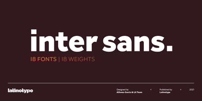
Inter Sans
by Latinotype
Individual Styles from $29.00
Complete family of 18 fonts: $139.00
Inter Sans Font Family was
designed by
Alfonso García,
Latinotype Team and
published by
Latinotype. Inter Sans contains
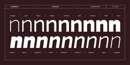
18
styles and family package options.
More about this family
- Aa Glyphs
-
Best ValueFamily Packages
- Individual Styles
- Tech Specs
- Licensing
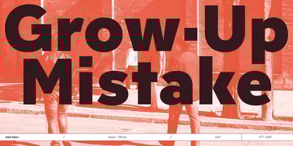
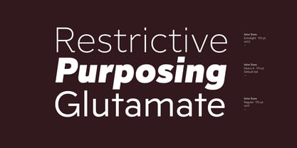
About Inter Sans Font Family
Imagine a sans Rockwell…
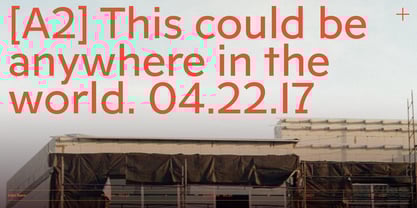
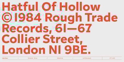
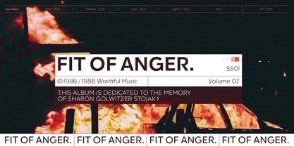
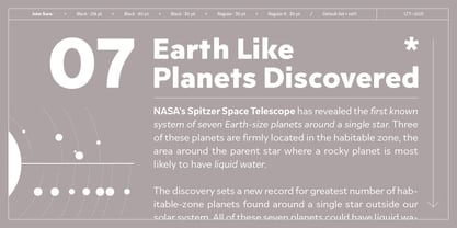
Well, we did it. That’s how Inter Sans was born—as a reinterpretation of Rockwell. However, as the process moved forward the font took on its own personality, adapted to current market and needs. Inter Sans is a new geometric sans with an early 20th century smell, soft curves and generous counterforms that give it a fresh look—a friendly font that communicates sincerity.
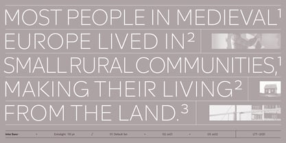
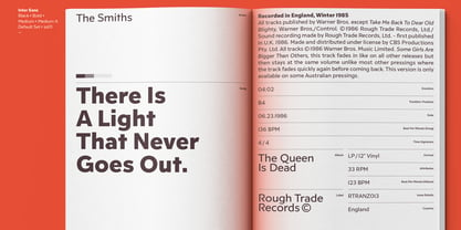
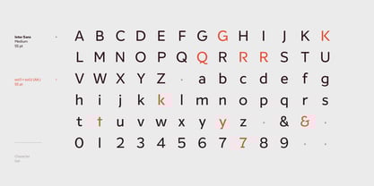
Inter Sans is well-suited for web use, apps, corporate use and short text (publishing). The font contains 439 glyphs—Latinotype’s basic character set plus alternative letters and signs—and supports over 200 languages that use the Latin alphabet.
Designers: Alfonso García, Latinotype Team
Publisher: Latinotype
Foundry: Latinotype
Design Owner: Latinotype
MyFonts debut: Mar 22, 2021
Inter Sans

About Latinotype
Based in Concepción and Santiago, Chile, Latinotype’s founders say, “Our goal is to design new typefaces remixing diverse influences related to our South American identity with high quality products for the contemporary design industry.” And the duo have been doing just that since their foundry’s creation in 2007. One of the most successful foundries on MyFonts in recent years, Luciano Vergara and Daniel Hernández, have put together a rapidly growing collection of typefaces in a wide array of genres. Specializing in colorful display and script faces, the group’s name “Latinotype” emphasizes the strong tie they feel to their cultural identity. The Premium foundry page can be viewed Here.
Read more
Read less
- Choosing a selection results in a full page refresh.