KEITH TRICKER. A TYPOGRAPHER’S TALE
My first introduction to typography, barring a kid’s set of ABC building blocks, was the pocket money purchase of a John Bull Printing Outfit, a sort of do-it-yourself rubber stamp kit with rubber characters, tweezers and an ink pad. I used it to create a business card which proclaimed me as leader of our neighbourhood gang, and learned my first lesson in the authority of type: people will believe anything they see in print!
At school I won a competition sponsored by RoSPA (Royal Society for the Prevention of Accidents) with a spiky hand-lettered poster and a headline that proclaimed “Carpets can cripple – fit them properly”, which looking back was probably the genesis of my future career as a copywriter and typographer. Although at the time I wouldn’t have known Bodini from Bog Standard, the letter style was rather reminiscent of Latin Wide.
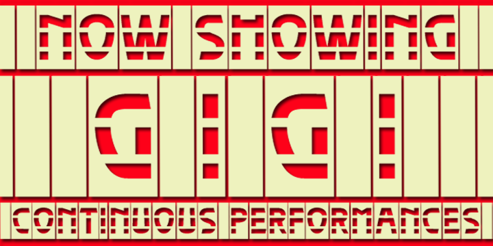
At art college I was introduced to letterpress proper in the form of beautifully made boxwood block letters and a cast iron flat bed press, which was love at first sight, and I have since been fortunate enough to acquire a collection of block letter fonts of my own. I’ve yet to find room in my house for a press of any description (with the possible exception of an Adana), but maybe when I retire I’ll build an extension and reinvent myself as a latter day Caxton.
My first professional involvement with type (although professional is putting it a bit strongly!) was working as a paste-up artist on a freesheet newspaper which was one of the first to be produced using the web offset process. On the day we ‘put the paper to bed’ as they say in the trade, we worked late into the night in a freezing asbestos-roofed shed that served as a studio, putting the thing together with Letraset, Cow gum and an IBM golf ball typewriter. This presented some interesting creative challenges when the Letraset sheet you were working from ran out of vowels or some other critical character!
When I joined an ad agency some years later, hot metal and Letraset had given way to photosetting, which was a blessed relief, although it was still in the Late Stone Age compared with today’s technology: the Linotype machine we had filled a room, and issued its product on a paper strip that still had to be pasted up!
There followed a depressing interlude when I felt, in typographic terms, too old to rock and roll, but too young to die. I was saved by yet another revolution in typographic technology that made it possible for me to create fonts, install and print them on my own PC. Bliss was it in that dawn to be alive!
Predictably, everyone at the agency mocked my early efforts – a prophet is never accepted in his home country – and on seeing my first font my boss opined that “Arnold Bocklin could sleep safe in his bed”, and that I should “stick to the day job”.
Well, gentle reader, here I am. Not yet a typo superstar (although you can help in that direction by buying my fonts!) but at least able to hold up my head in circles where fellow aficionados gather. God bless you all!