Hello, and welcome to the REN FONT foundry!
REN FONT has steadily built its reputation by repeatedly earning accolades in the Typeface category of the “Yearbook,” an exhibition organized by the Japan Typography Association (NPO). Founded in 2001 with the aim of bringing a fresh breeze to the font industry, REN FONT continues to create distinctive typefaces that stand out.
The hand-drawn-style fonts crafted by REN FONT’s type designer, Kazuo Kanai, have received high praise from professional designers and typographers for their exceptional quality.
A Message from Kazuo Kanai
With the exception of our comprehensive typeface Waon, our company has been particularly dedicated to producing kana fonts in the traditional Mincho and Gothic styles. Most of these fonts have been developed as multi-weight families — and there’s a good reason for that.
In Japanese text, kana characters account for roughly 70% of the total. Even so, kana fonts have little significance on their own; it is only when combined with kanji that they take on “meaning” and come to life.
Most vendors offer font weights in seven to nine variations, from “Light” to “Ultra,” but there are no universal standards for these weight categories — each vendor defines them differently. As a result, a “Light” weight from one vendor may differ subtly in thickness from another. For kana fonts to pair harmoniously with such variations and truly come alive, a finer gradation of weights is essential.
This is why our kana fonts feature such detailed weight variations.
Simply changing the kana can greatly enrich the expression of a typeface.
We hope you will make the most of our kana fonts, blending them freely with other typefaces to create combinations that perfectly suit your taste.
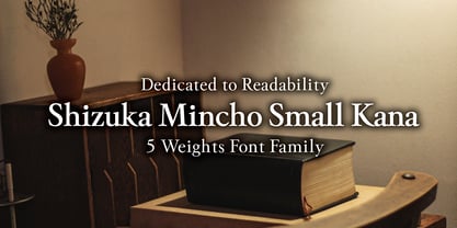
A Focus on Readability
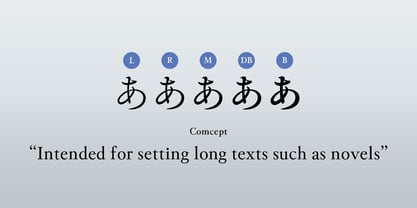
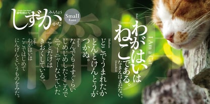
Shizuka Mincho Small Kana 5-Weight Font Family
A straightforward form ideal for novels and long text.
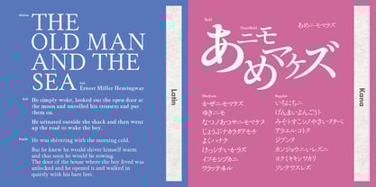
While 靜明朝小かな (Shizuka Mincho Small Kana) resembles traditional typefaces, it is not a revival. Instead, it is a well-balanced design that infuses a modern sensibility into a classical form. Mincho kana often carry distinctive quirks, but Shizuka Mincho minimizes these as much as possible, resulting in a clean and straightforward style. The typeface comes in two versions: Large Kana and Small Kana. This font is the Small Kana version, optimized for vertical typesetting, offering a calm, highly readable form well-suited to pure literature.
Based on the natural handwriting of our type designer Kazuo Kanai, Shizuka Mincho combines the refined structure of traditional Mincho with a touch of modern atmosphere. The family consists of five weights—Light (L), Regular (R), Medium (M), Demi-Bold (DB), and Bold (B). While it preserves an old-style feeling, this Small Kana version follows traditional proportions, yet still carries the versatility needed for modern composition.
Why It Excels in Vertical Typesetting
Today, horizontal text has largely become the norm. Newspapers still use vertical typesetting, but beyond that, it is mainly seen in novels and literary works. However, kana were originally designed for vertical writing, and problems arise when they are forced into horizontal layouts. Many kana characters are naturally narrow, which leads to awkward spacing in justified text and makes reading more difficult. In truth, we are accustomed to reading text that is harder to read than it should be, simply out of habit.
Shizuka Mincho Small Kana addresses this by being designed overall in a slightly smaller scale. Vertical text benefits from Small Kana: the largest kanji, the slightly smaller hiragana, and the smallest katakana coexist to create a natural rhythm. This balance enhances readability, allowing for long periods of reading without fatigue.