Creative Characters: Up and coming — Joana Correia
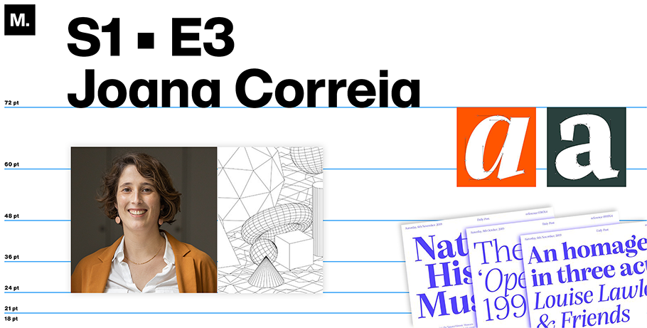
Born in Porto, Portugal, an ancient seaside city where she was classically trained as an architect before entering the field of type design, Joana Correia has enjoyed a 20-year career shaped by her twin drives to learn from the old while creating something new.
It was thanks to her first trade that she stumbled across the second. Correia discovered typography while organizing architectural exhibitions and creating lettered signs to explain the drawings. “I started to understand that I prefer this kind of innovative work to the more established practice of designing buildings, to architecture itself,” she said.
Today, her interest in tradition versus innovation, among other dualities, continues. In a recent Zoom interview, we discussed her penchant for intertwining the classic with the current, how she’s combining art with commerce, and why she considers herself outgoing, even as she spends most of her time happily working alone from home. (Our conversation has been condensed for clarity.)
MyFonts: First, tell me about your hometown of Porto. What is it like?
Joana Correia: It has a lovely old city feel. It can look cold and gray in the winter, because it’s all granite. But then, in the spring, it’s beautiful, with lots of color. Porto’s bordered by the Atlantic Ocean and Rio Douro. The river’s quite tight; you can see both its banks. That creates a dramatic feeling. Meanwhile, the ocean spreads out your eyes, opening you to the outside. I think that’s reflected in Porto’s residents: we are like the city, with its strong stone buildings, but then like the sea, we are also very open to foreigners and visitors.
MF: Has living there influenced your design work?
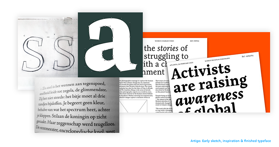
JC: Yes, some of my typefaces reflect Porto’s history, including its occupation by the Romans. For example, my Artigo typeface, a text font, was influenced by the first Roman types. It drew on the same roughness and style we see in fonts like Granjon and Jenson. But that was just the inspiration — because Artigo doesn’t attempt to be a revival. It’s rooted in classicism, but its shapes are intuitional, growing from the design.
MF: Has Porto, in its more contemporary form, similarly influenced your work?
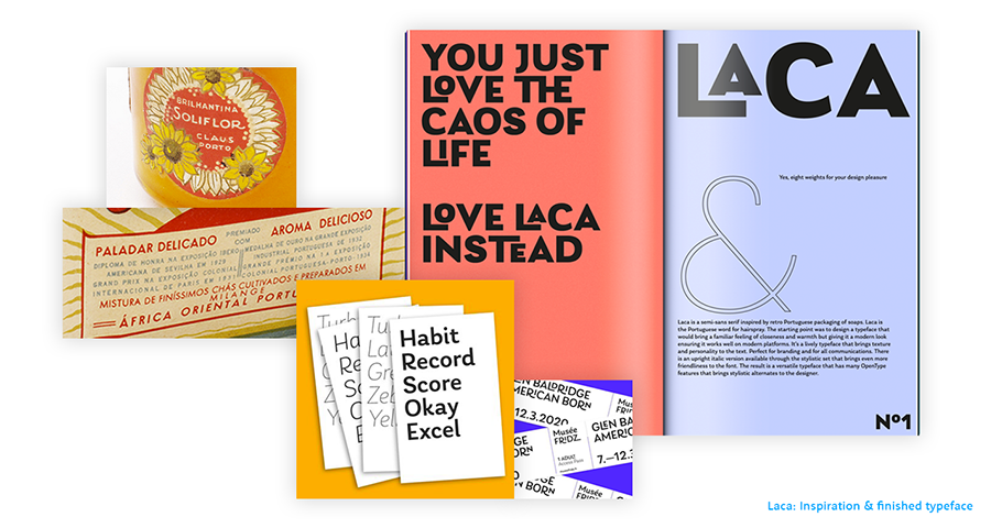
JC: Yes. My font Laca pays tribute to an Art Deco advertising style that was broadly popular in the 1950s and ‘60s and used for items ranging from signs to soap wrappers. (There’s a large soap-making industry in Porto.) The style found its way here via French designers like Roger Excoffon, one of my favorites. You can see it in the antique shops sometimes. It was the first sans serif used in this kind of packaging. Both it and Laca pair using more expressive fonts with trying to keep the lettering clean enough to read. So Laca (“hairspray,” in Portuguese) is a bit like a retro font, but it doesn’t nod at the old, old like Artigo.
MF: I’m intrigued by how often you pair the antique with the novel — or otherwise explore seeming opposites. For instance, even now, as you’re artfully designing fonts for clients like Google, you’re also working to earn your MBA. May I ask where — and why?
JC: Porto Business School. It’s a crazy thing to do as a creative person! Not only does it involve learning business skills like leadership, but also compels you to study finance and marketing. It’s very far from type design. It’s mostly focused on digital innovation, e-commerce, artificial intelligence: all those things that are super important right now.
MF: Sounds as if you’re staying current, even if the skills that you’re building aren’t immediately connected to typography. But what do you feel you’ve learned from B-school?
I learned I was better in accounting than I thought I was! Also, we just did the Myers-Briggs personality test. I don’t know the results yet, but I’m curious. I always thought I was a bit more outgoing, but it seems I’m also introverted. I definitely see that I’m the creative type, and everyone else in the program, they think in numbers. Me, I think in terms of process. So I have some skills they don’t.
Ultimately, I do think the program will help with my design thinking. I’m trying to think in more disruptive ways.
MF: Here’s a business school question: where do you see yourself in five years?
JC: I hope I have a bigger library. I’m finishing up one font this year and I want to design more. As for the solitude of working from home: it will probably continue.
MF: Can you share the mechanics of how you do your design work?
JC: I don’t do many hand sketches on paper instead, I use GlyphsApp to design fonts, so much of my sketching is done using this app that’s special to designing typefaces.
MF: What makes digital designing superior for you?
JC: Designing directly on the screen and using the app makes it faster to test whether the design works well or not. I can type words with the letters that I engineer, and because what I’m doing is creating a fully functioning font, it’s great to test it in the early phases, to try out the concept.
As for the GlypsApp: it makes it very intuitive to design using Bézier curves and then easy to test and write with just a few letters, helping to create the system of a font.
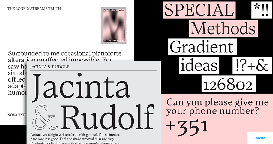
Loretta - a future font by Joana Correia
MF: When you consider your future, one that brings together both your business and your creative efforts, what do you hope it holds for you?
JC: I hope I’ll continue doing everything I’m doing now, only more of it! This process of creating will continue.
Susan Comninos is a freelance journalist. She’s contributed to The Atlantic Online, The Boston Globe, Chicago Tribune, Christian Science Monitor and Jewish Daily Forward, among others. She lives in New York


